Tampax Rebrand Full Process
Role: Brand DesignerTools: Adobe Illustrator, Adobe Photoshop
Time: 9 Weeks, 2023
A more confident & inclusive approach to menstrual product branding.
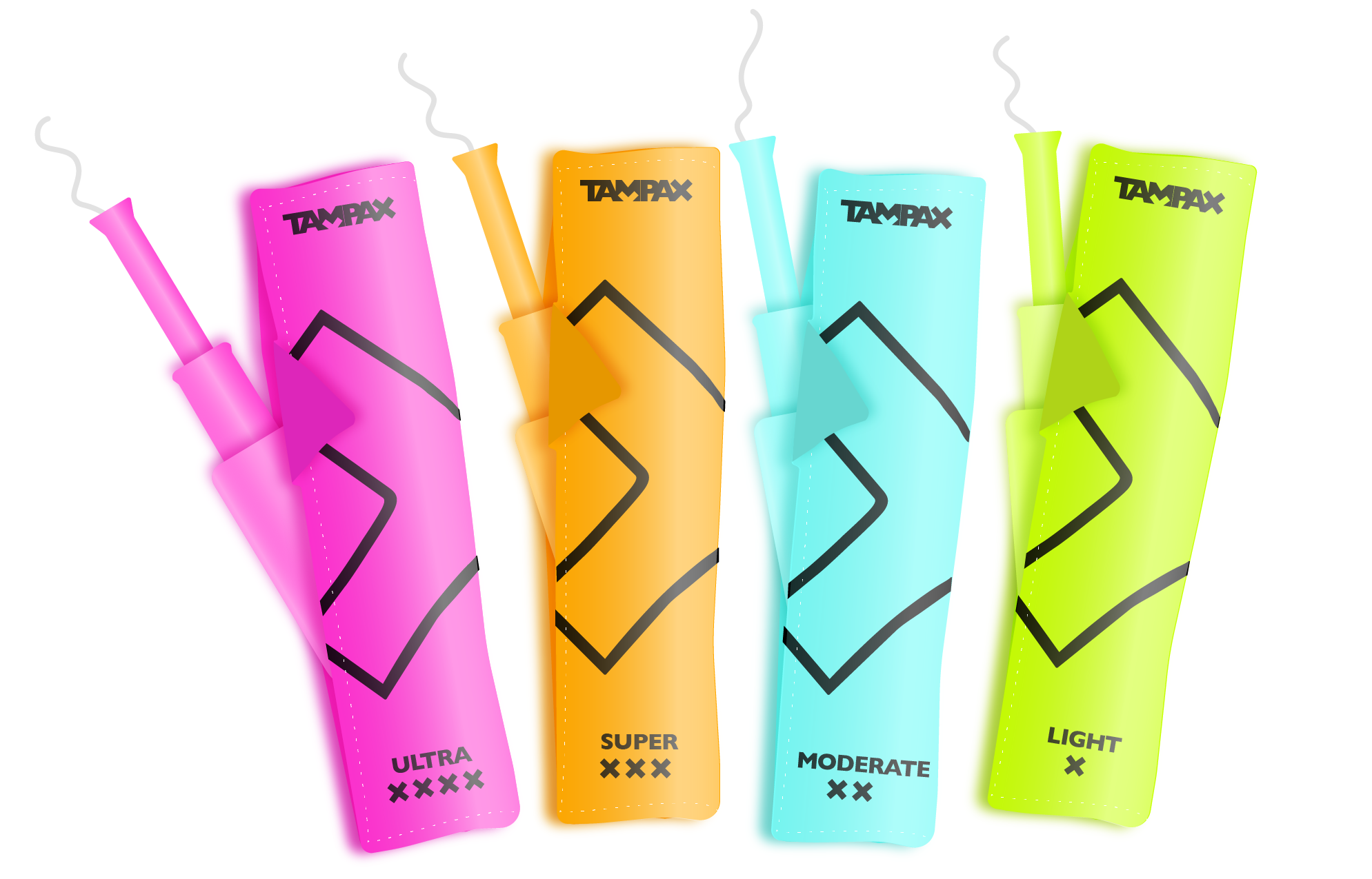
How might I rebrand Tampax so that it is more gender-inclusive, stands out on a shelf, and supports the destigmatization of menstruation?
Brand Voice
Start with the word “humanity” I allowed my brain to freely ideate a variety of words. Because not all people who menstruate identify with feminity, I chose to start my ideation process with gender-neutral language.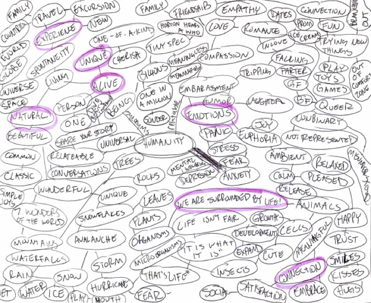
Tampax is...
Gender-Neutral
Natural
Empowering
Community-Centered
Logo Concept Development

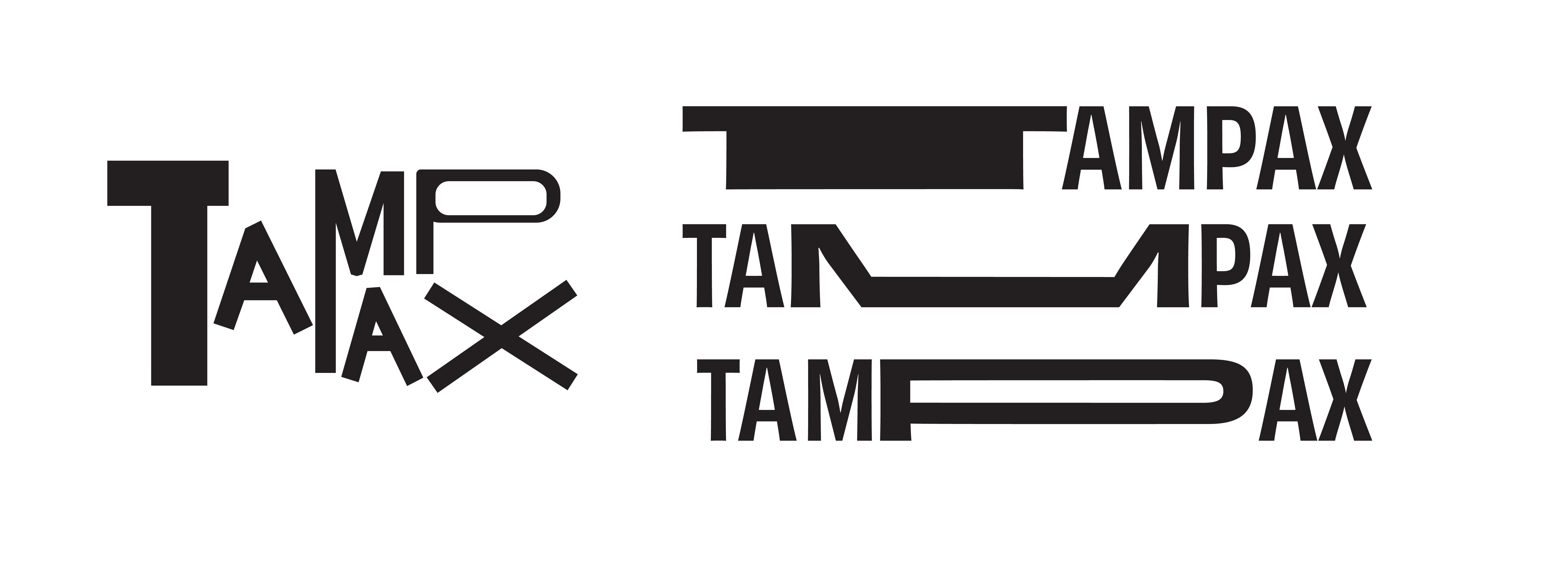
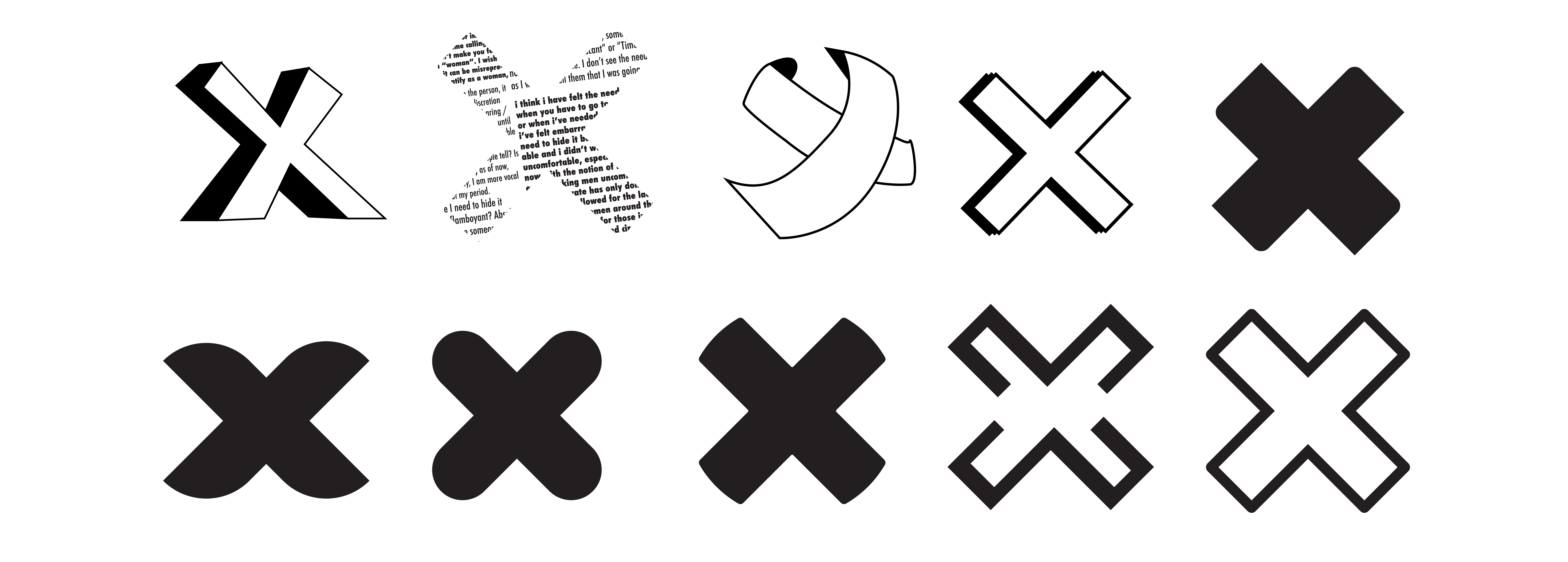
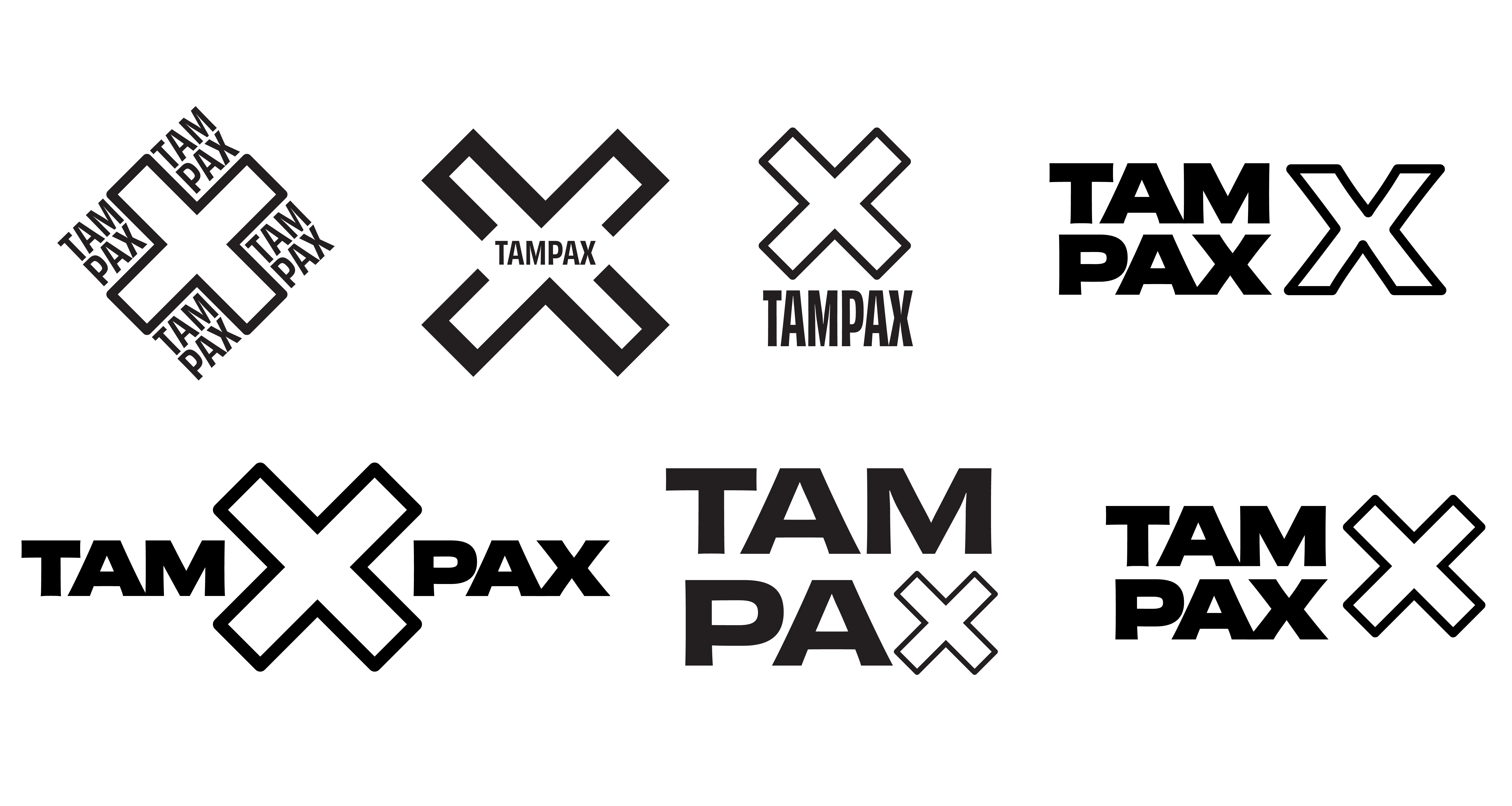
After many iterations of concepts, I narrowed down my ideas to the following concepts: an “X” logo to suggest potential tagline “stop the stigma” (about menstruation), and a variable type logo that represents the individuality yet connectedness of humanity.
Logo Refinement
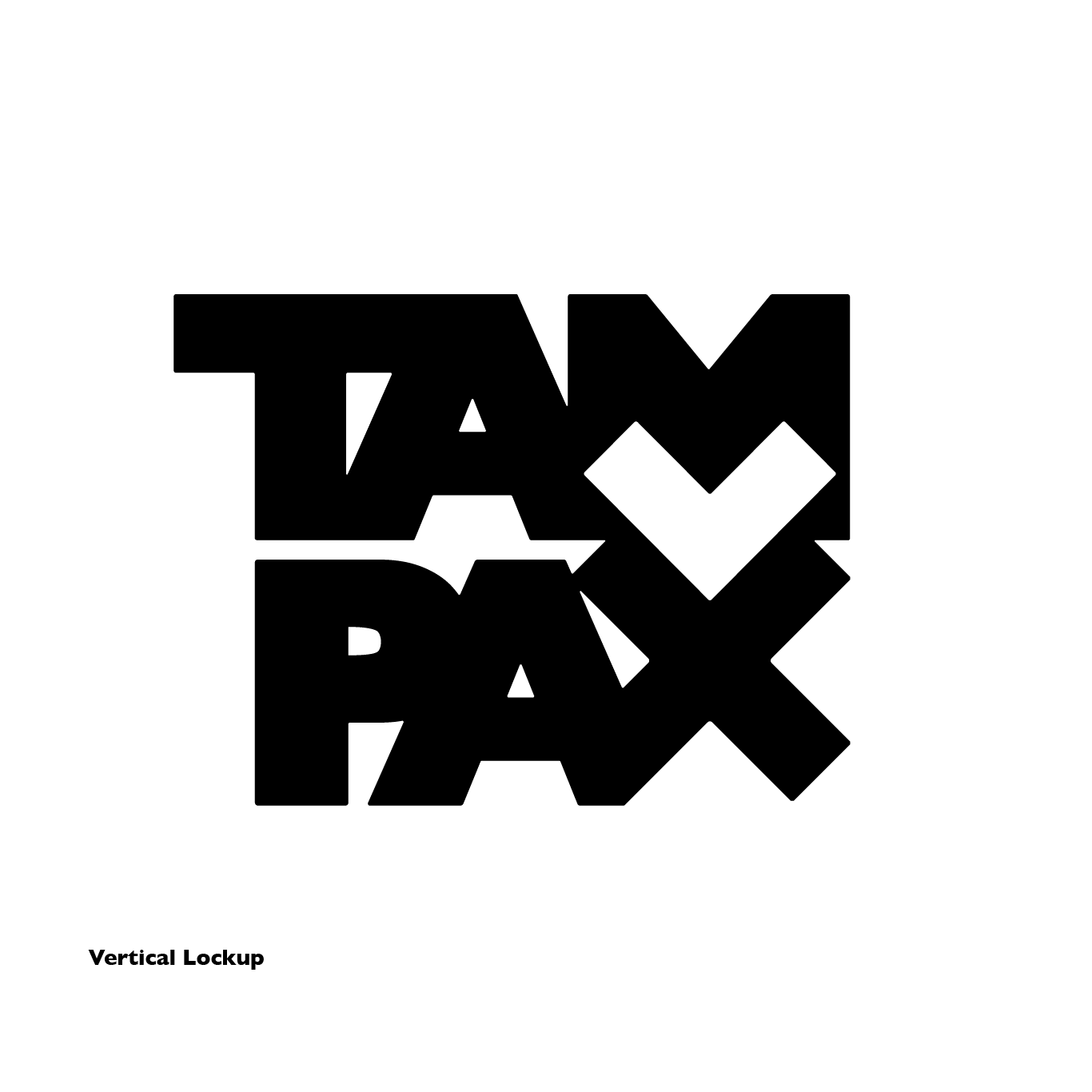
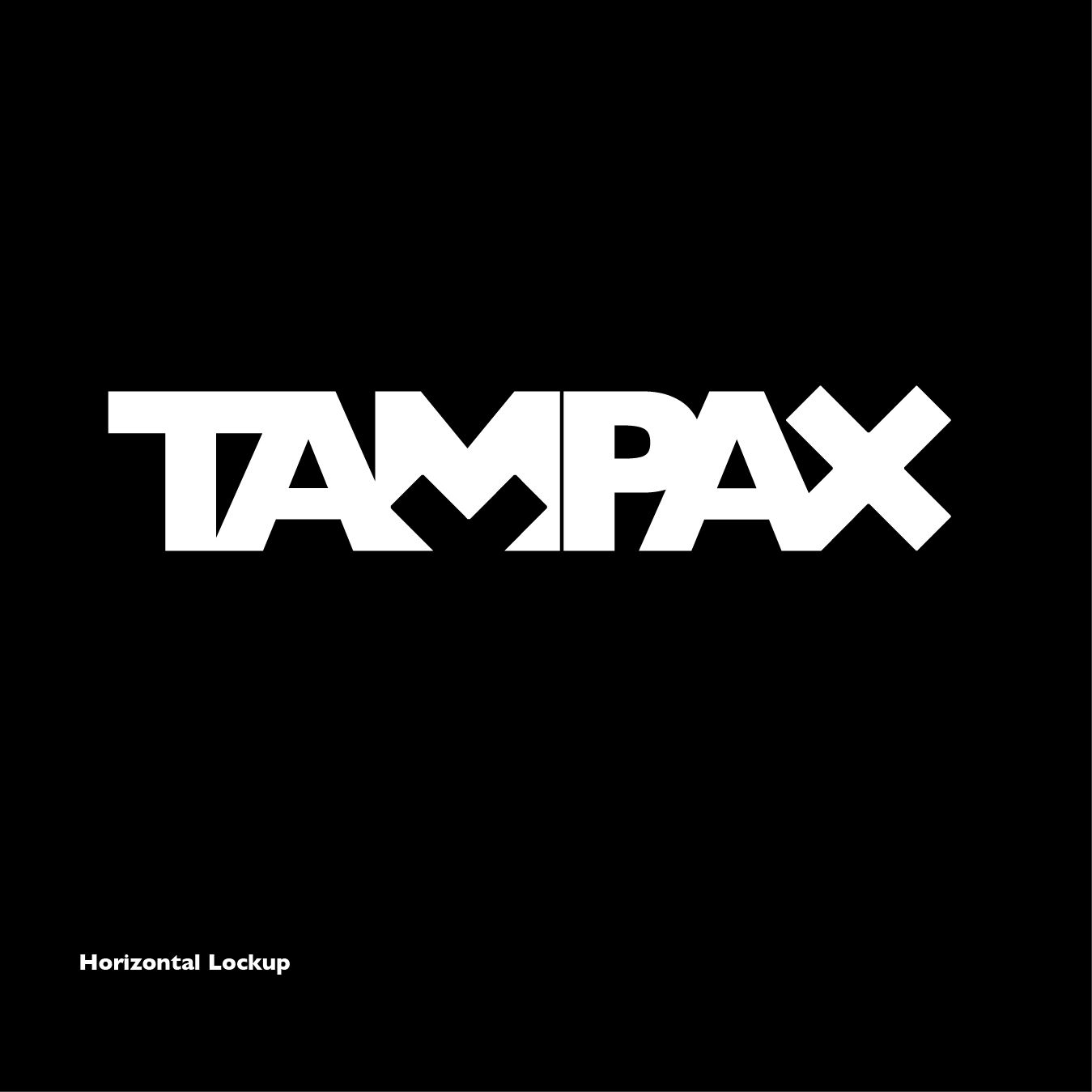
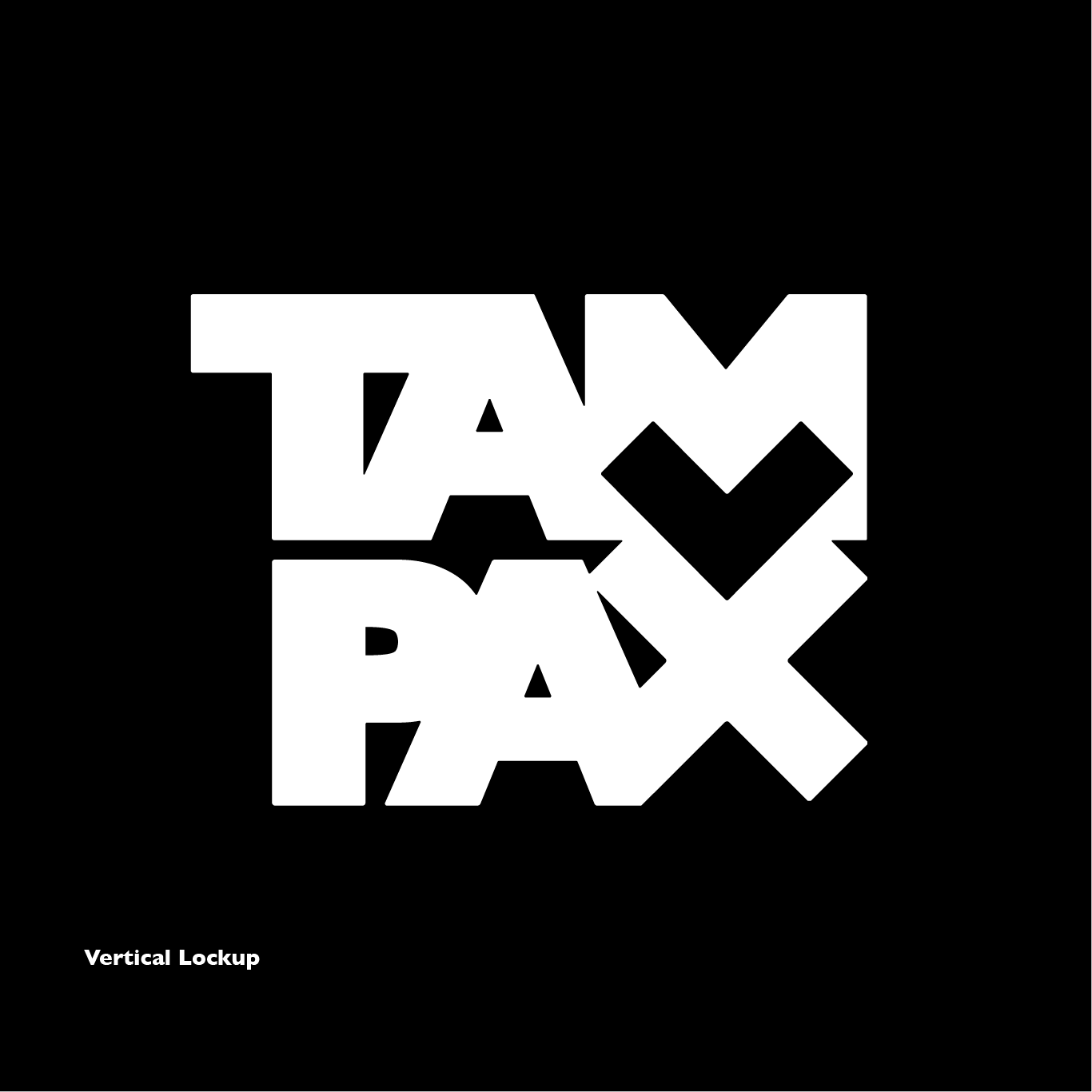
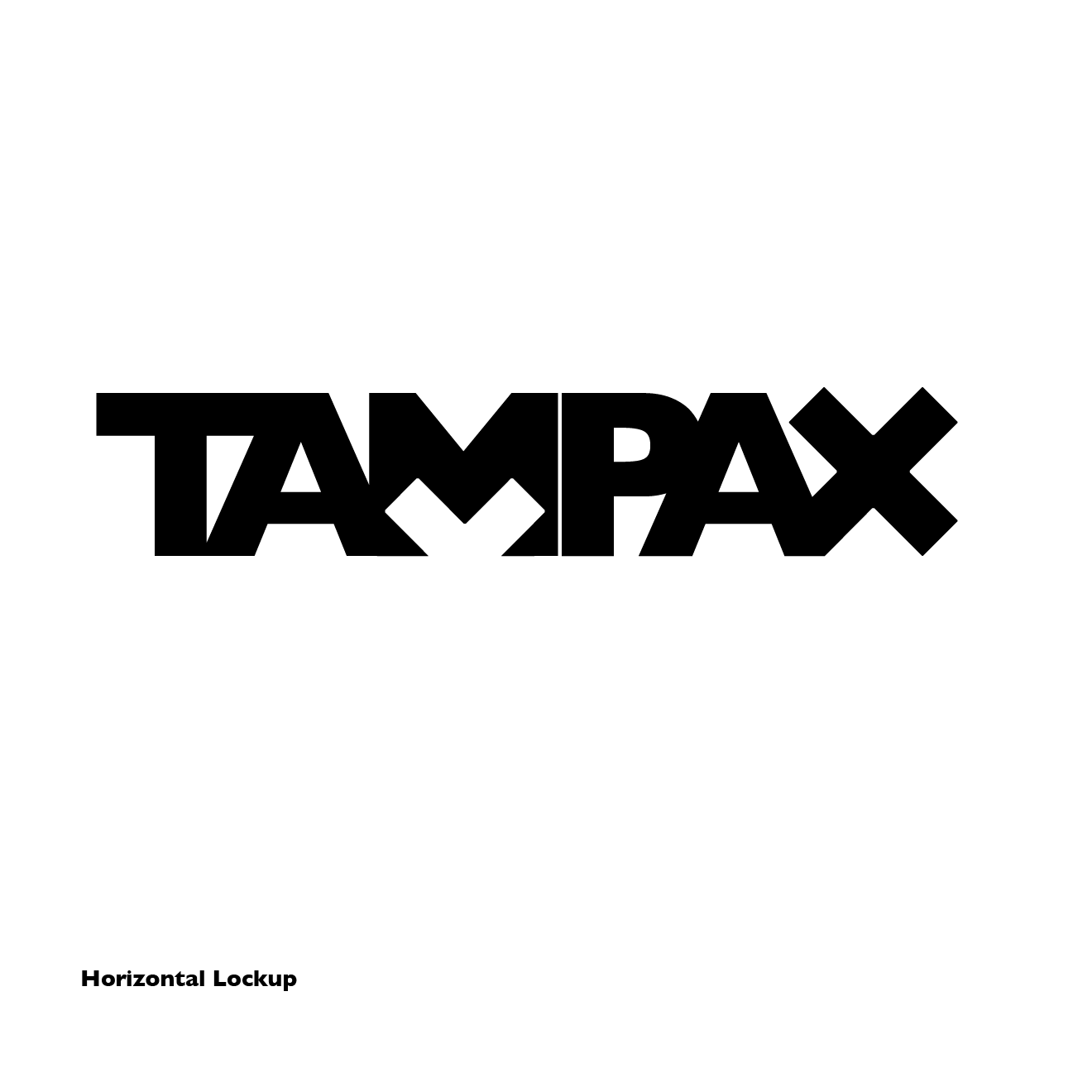
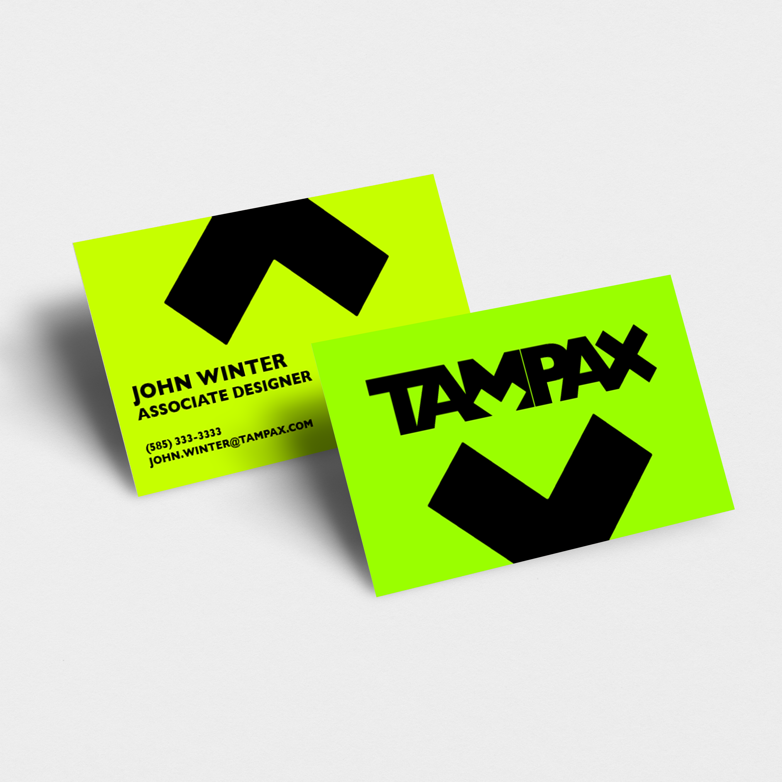
I chose to work with the “X” concept because it visually represent the concept of “stop”, alluding to the destigmatization of menstruation, and it is bold, loud, and confident on a shelf next to other menstrual products.
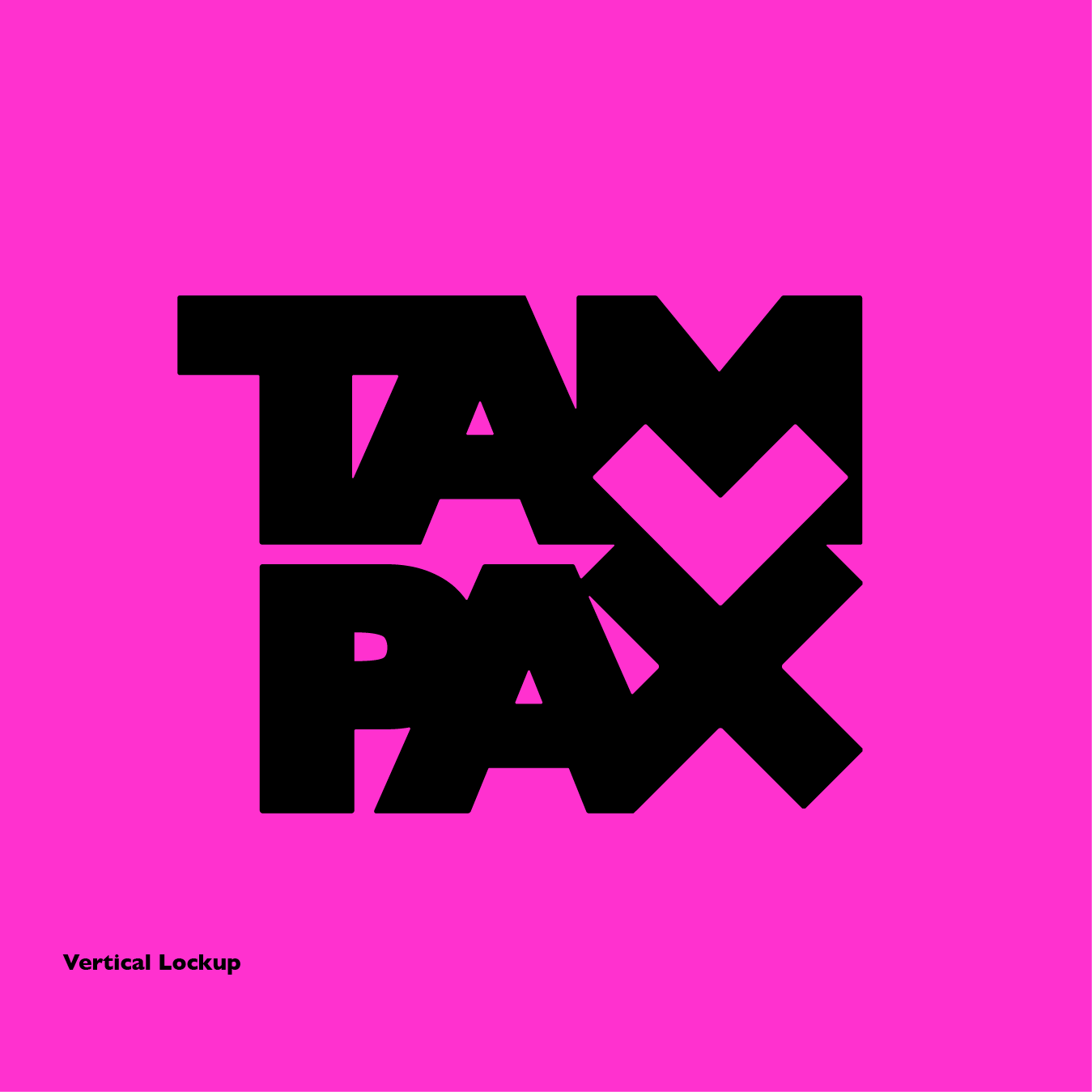
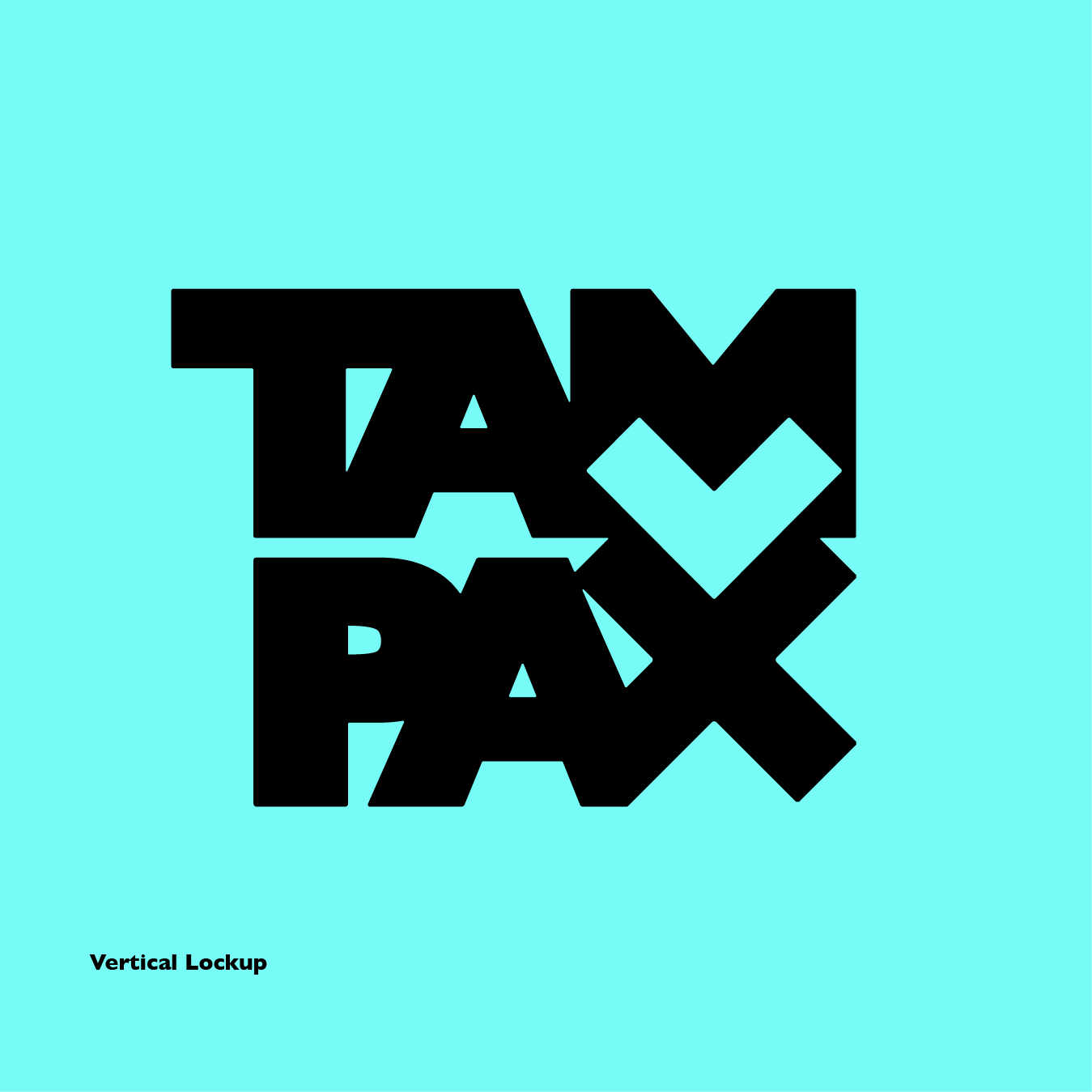
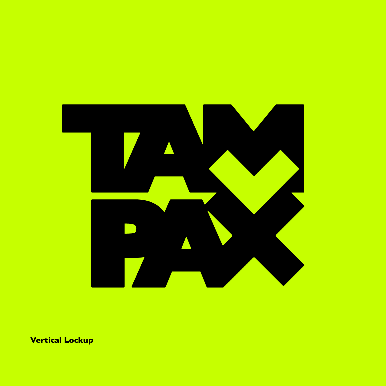
My final lockups add another layer of meaning with the negative space creating a heart shape in the “M” counterform.

Packaging
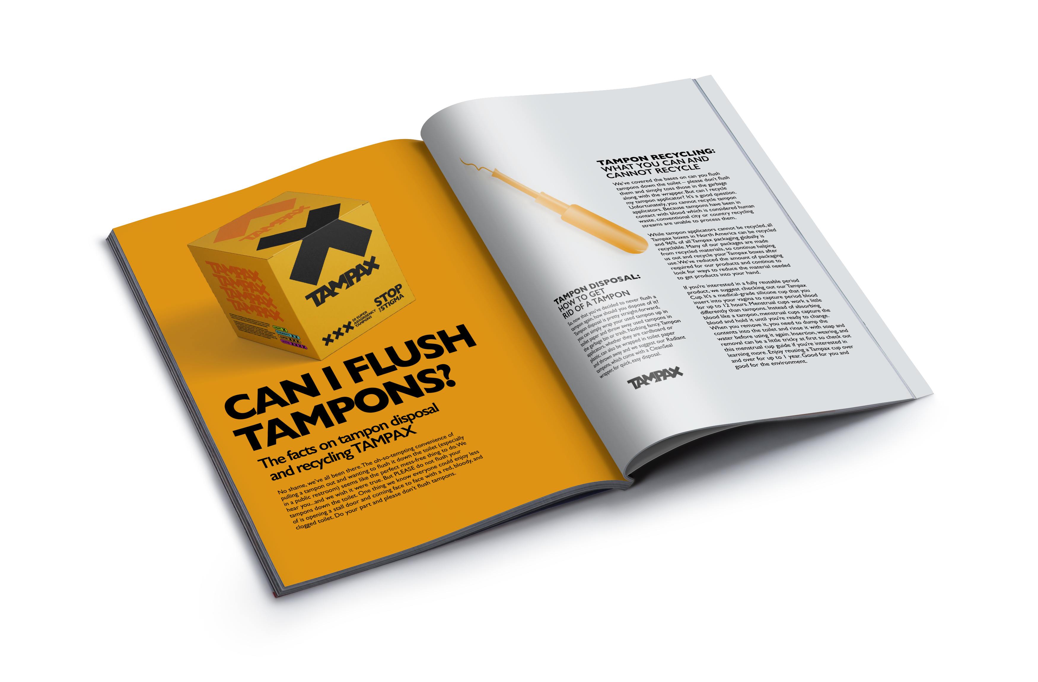
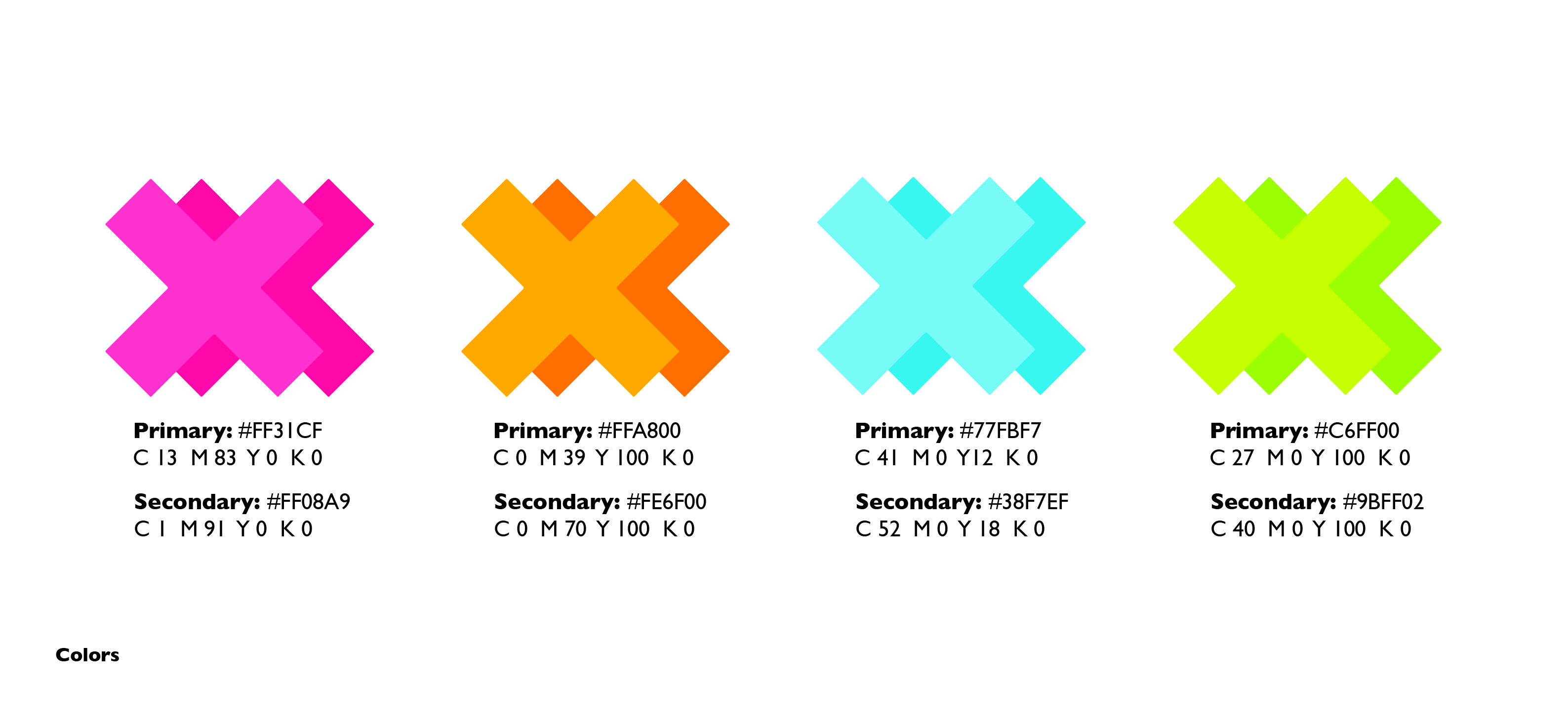
Using the system defined by the logo, I designed packagin that crops the oversized “X” and uses bold neon colors to indicate absobency levels.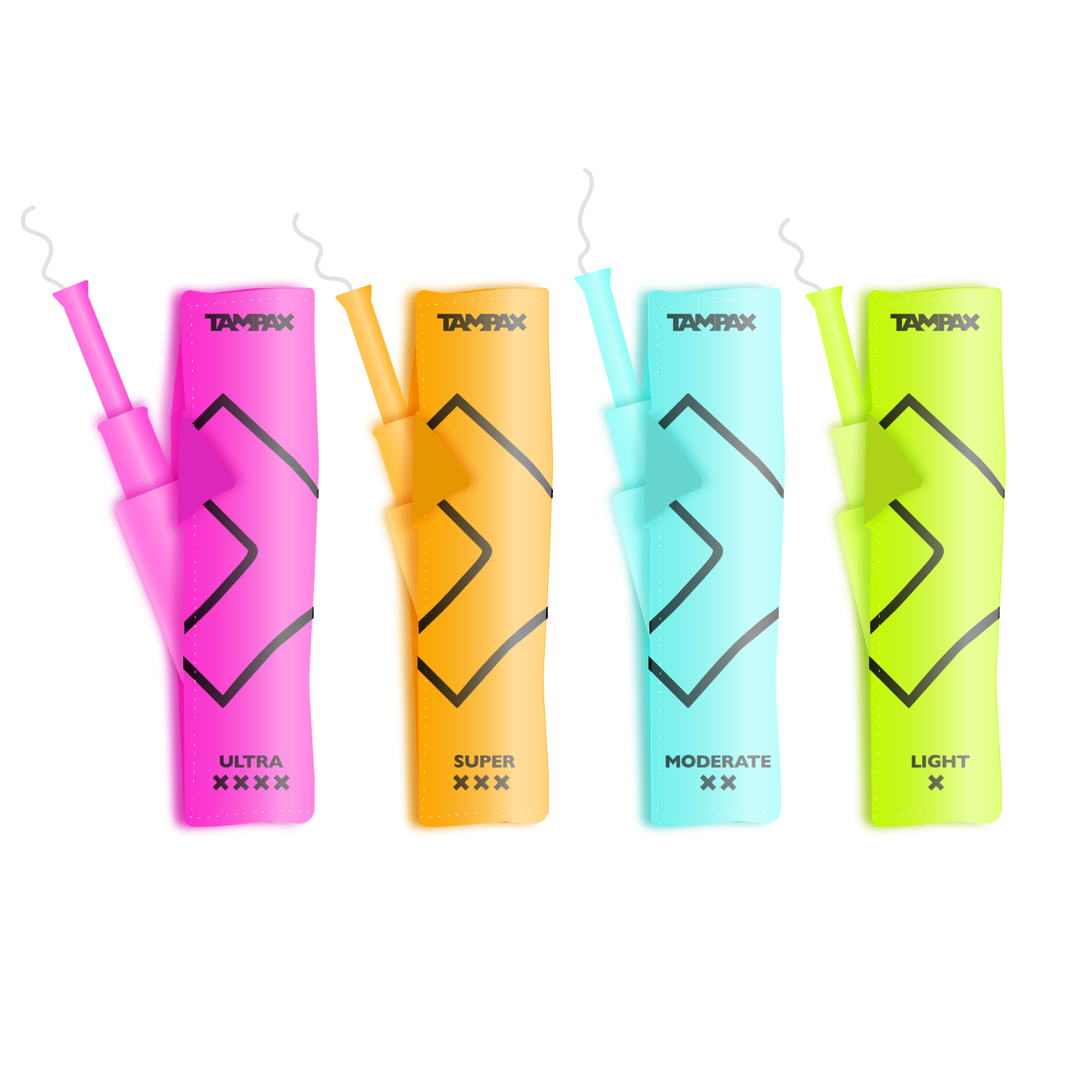
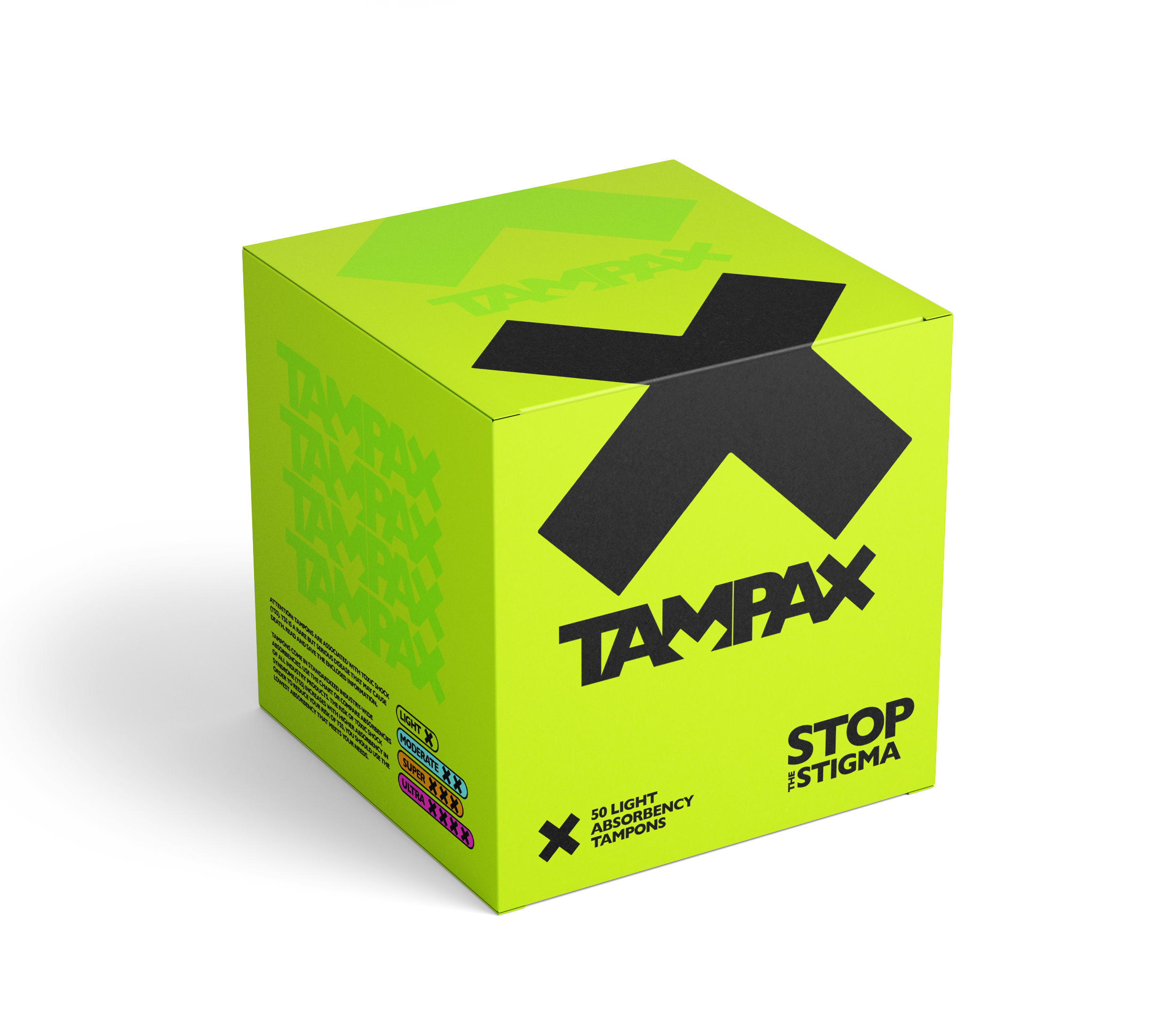
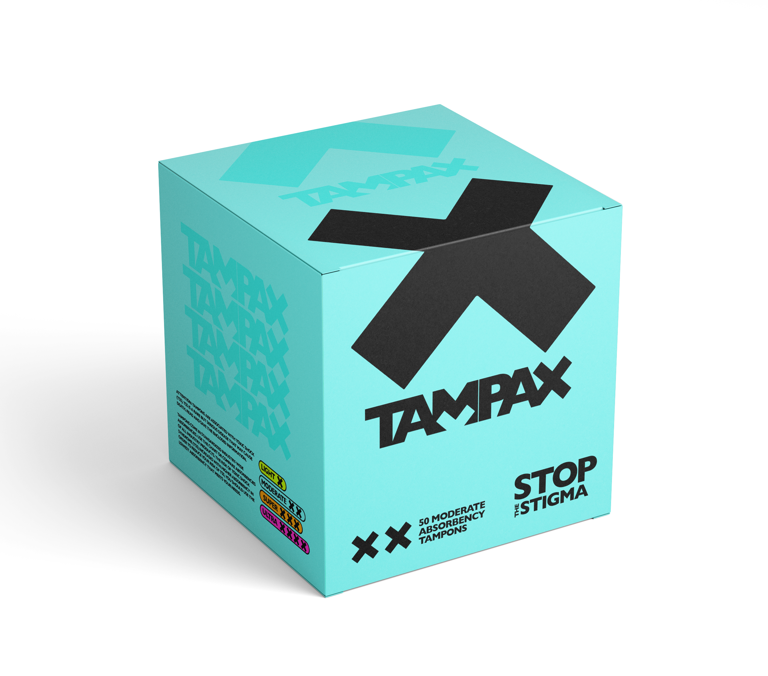
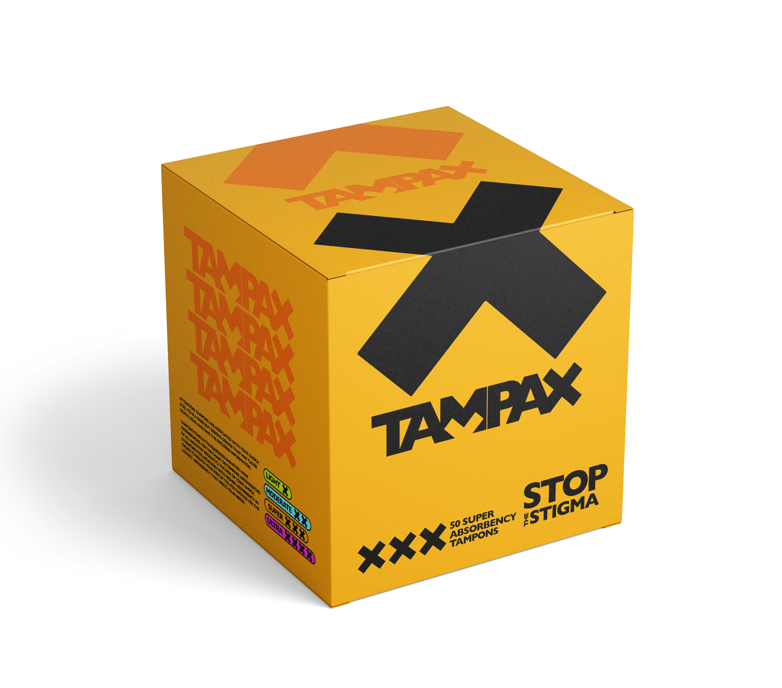
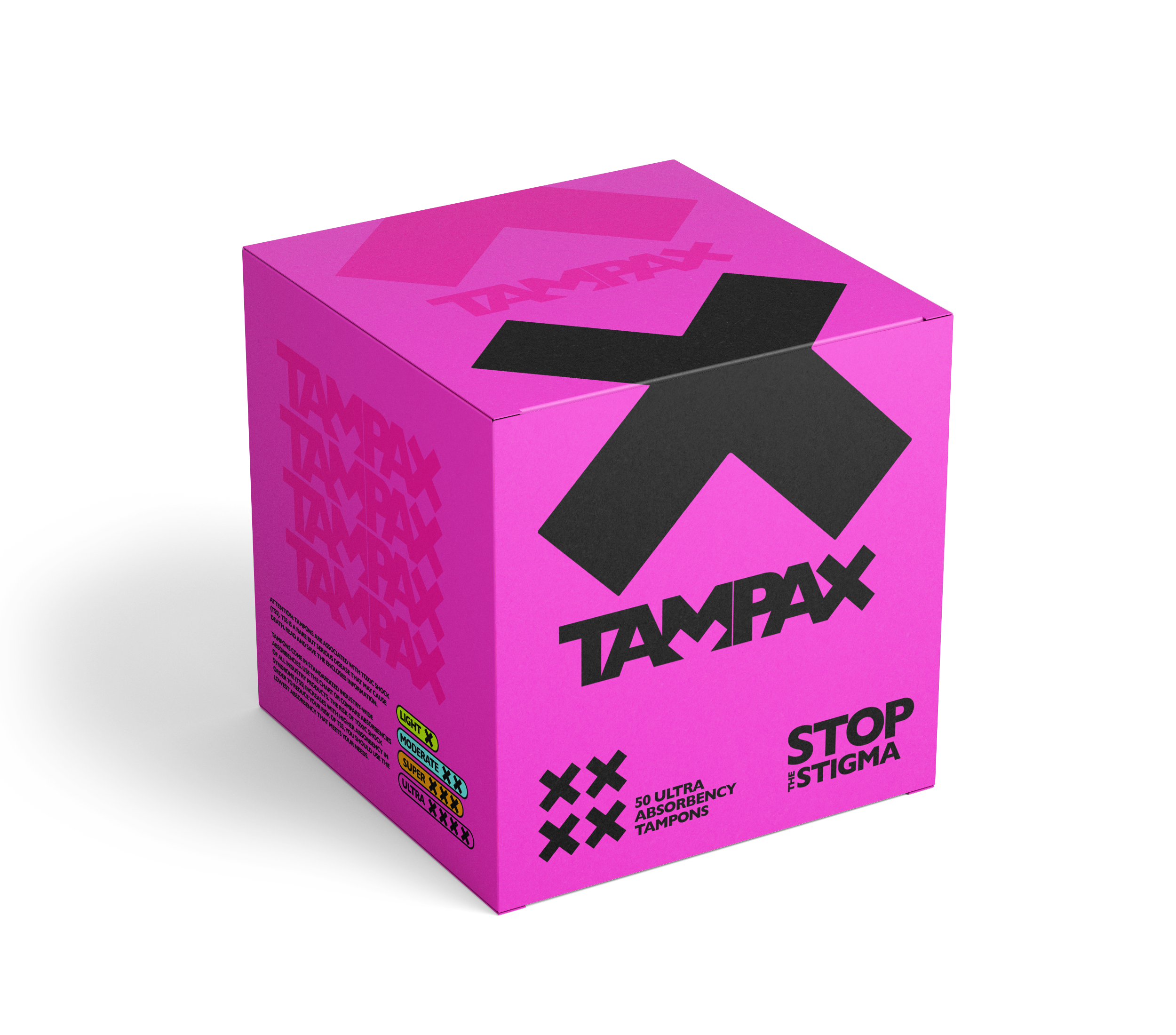
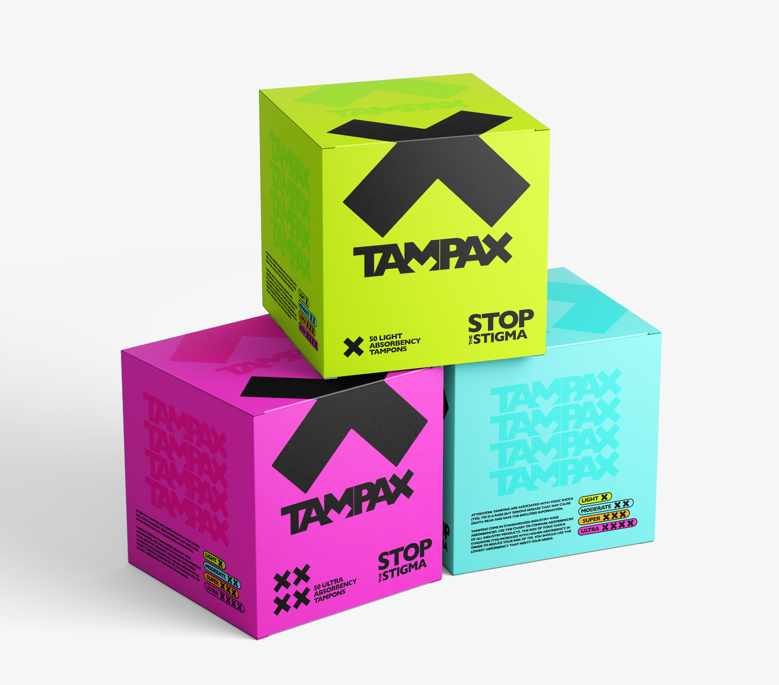
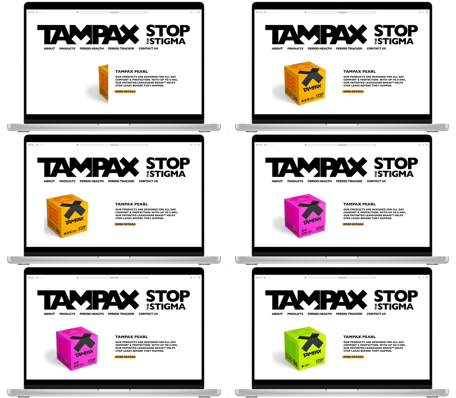
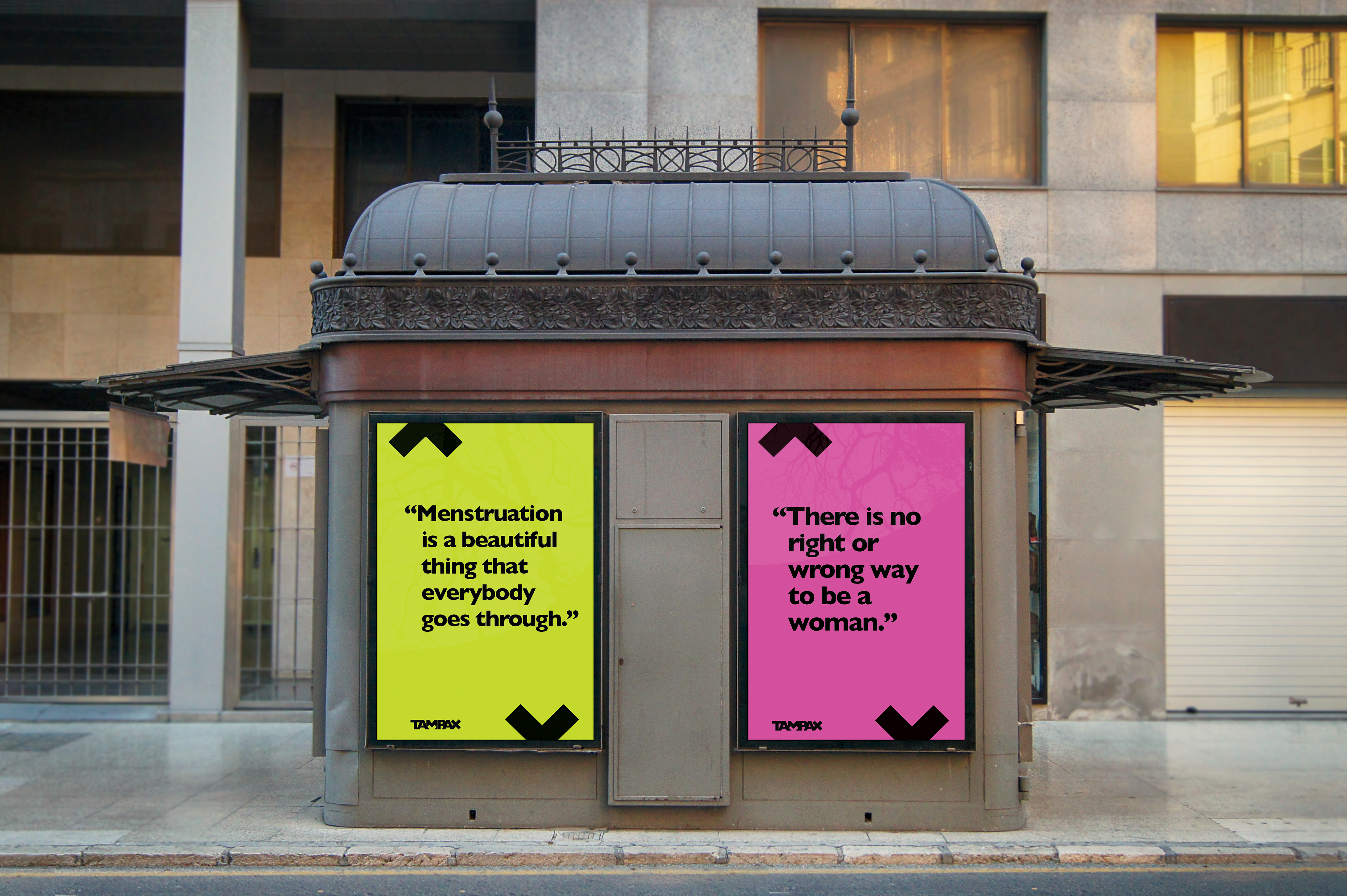
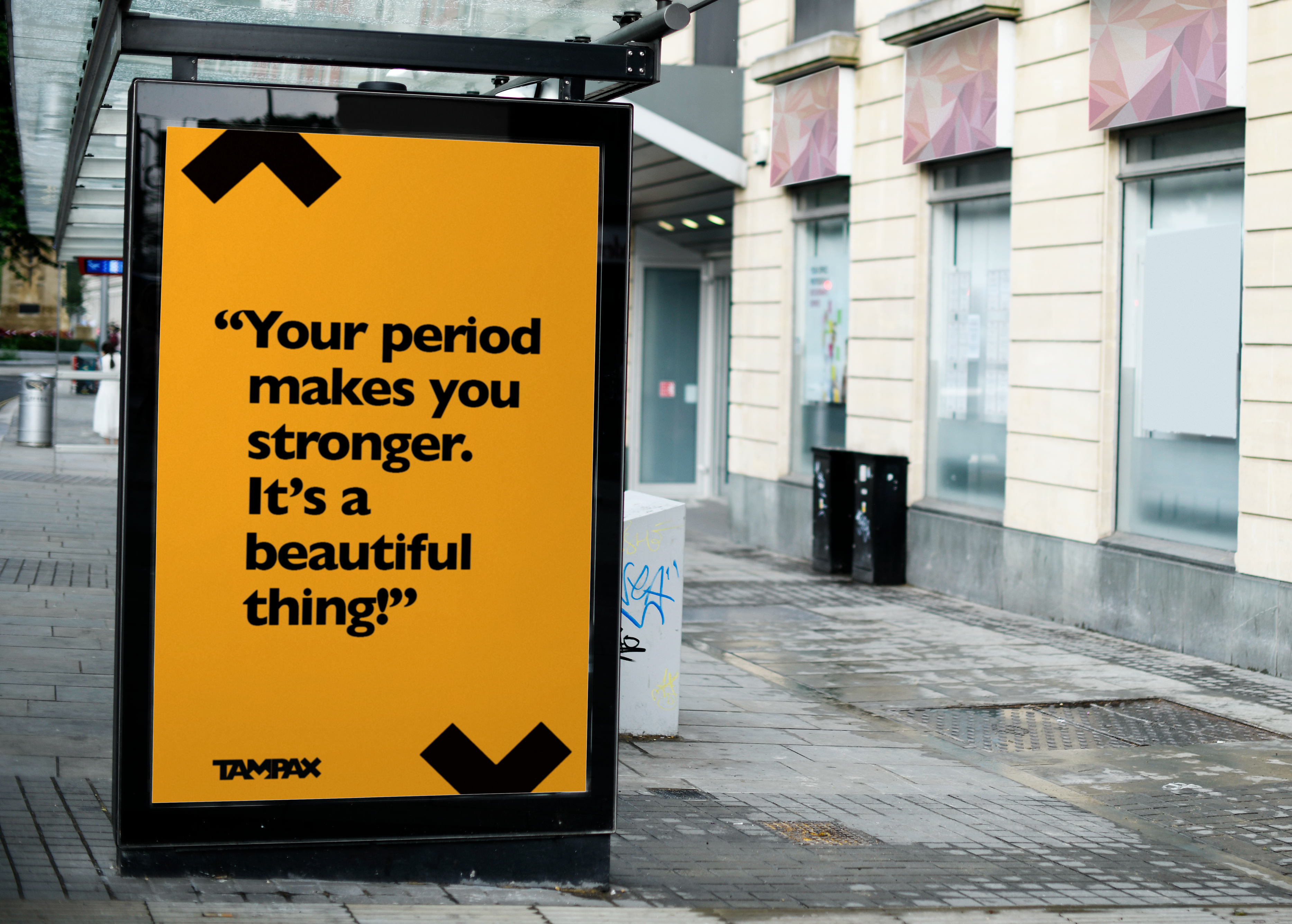
Highlighting real voices to normalize and destigmatize.
I surveyed period-havers and pulled memorable quotes to use as an advertising campaign. By highlighting the things that these individuals wished they knew when they were younger about periods, it can spark conversations among viewers and ultimately help destigmatize menstruation.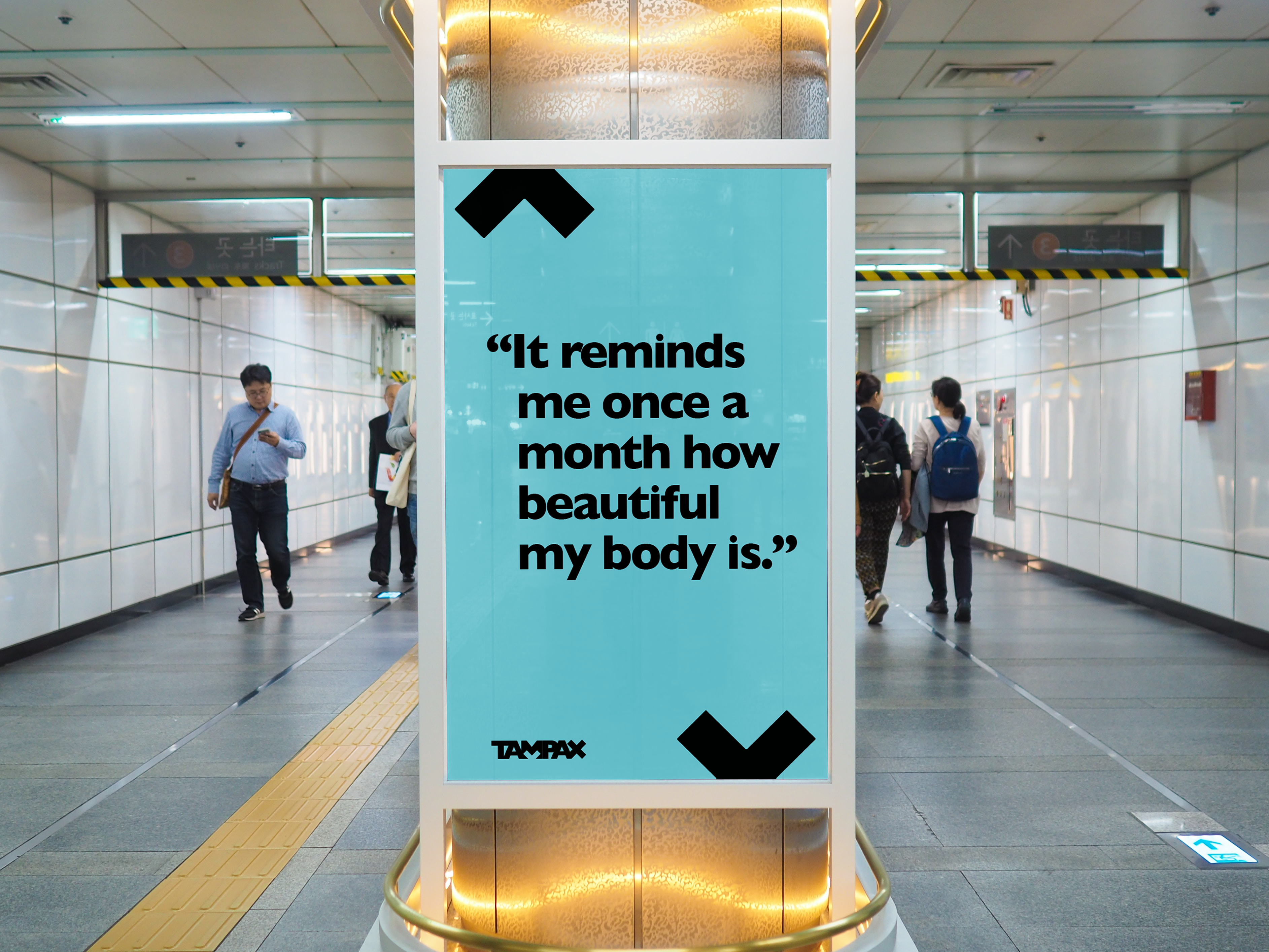

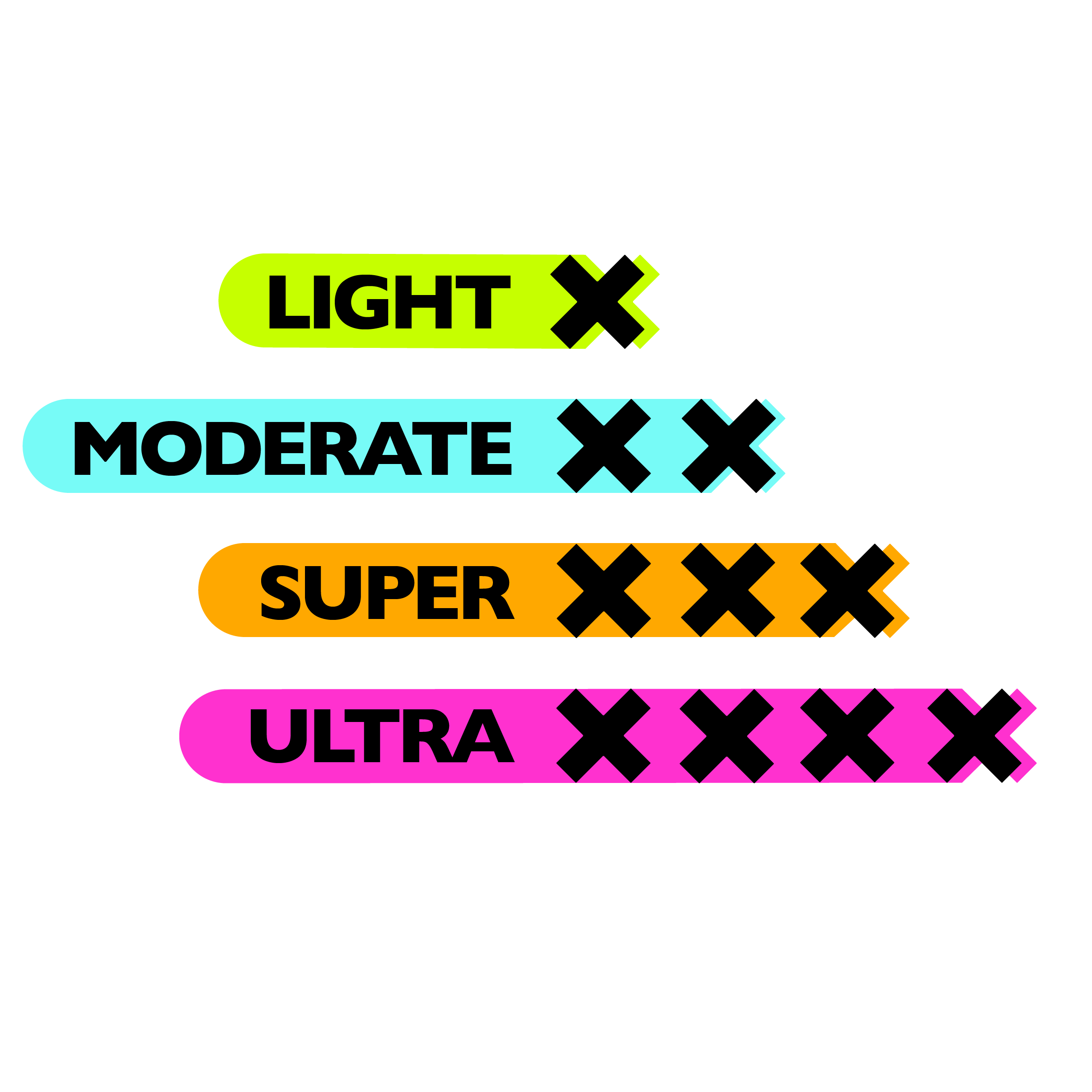
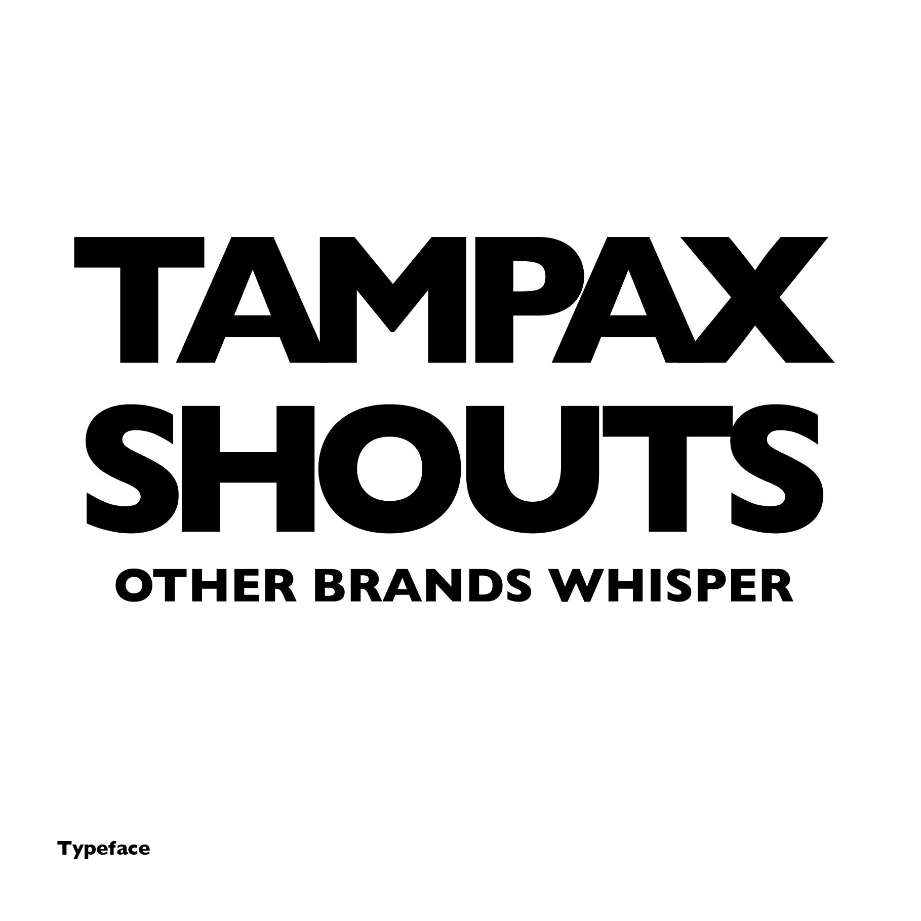
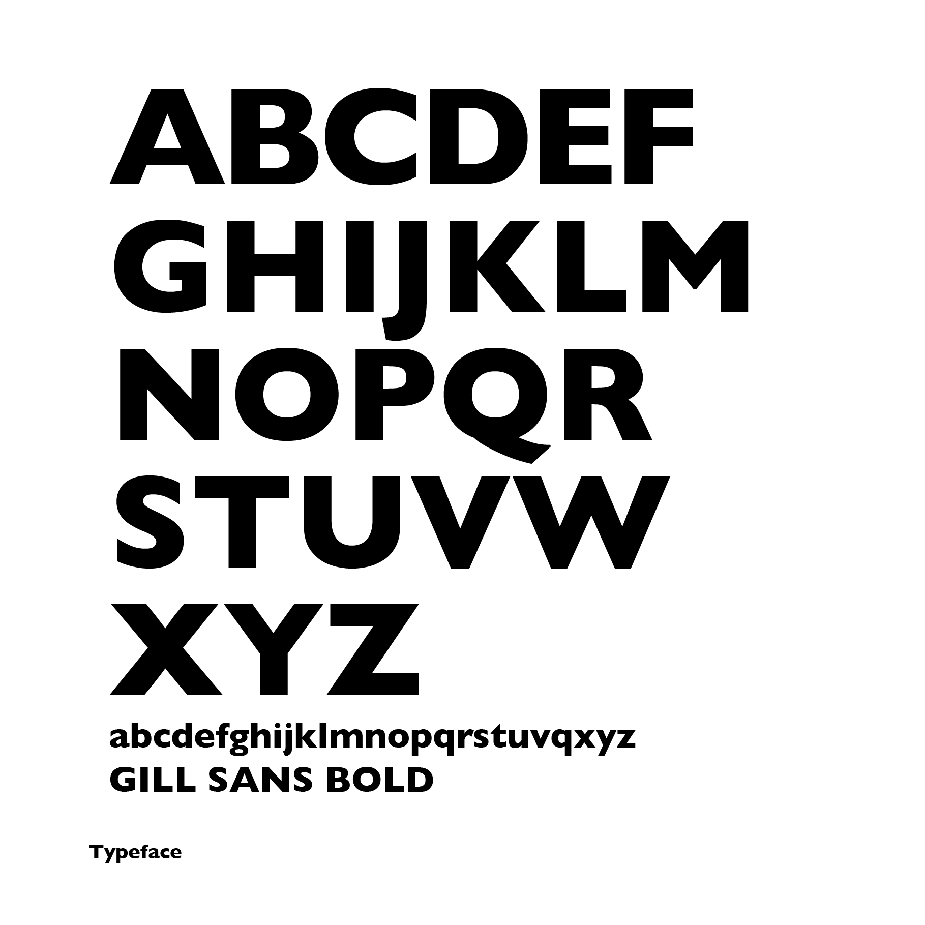
Brand Guidelines
What’s Next?︎︎︎
View Common Ground, a gestural interface that bridges gaps in the outdoor community.