Quilting
Outside of design, I am an artist. My favorite tactile medium is fabric, and I have found a passion for combining my interest in typography with quilting, most frequently created through screenprinting processes. Each of these pieces took roughly one month to create.


Relentless Chaos
The self-prescribed brief asked that I create a quilted wall-hanging piece using the process utilized by Pat Pauly. The piece builds upon concepts in my thesis of contrasting chaos and order. I wanted to communicate this sense of entropic tension with typography and using this fluid process.
I began with screen printing intuitively on a white piece of fabric. I limited myself to the following elements: the grid, the intentionally broken grids, the lowercase "a" (Scala Pro), the blocks of text (9 pt. Futura) written in repetitive alphabets, and only pink and green ink. I layered these elements over and over on themselves, creating a mostly green piece of fabric and a mostly pink piece of fabric.

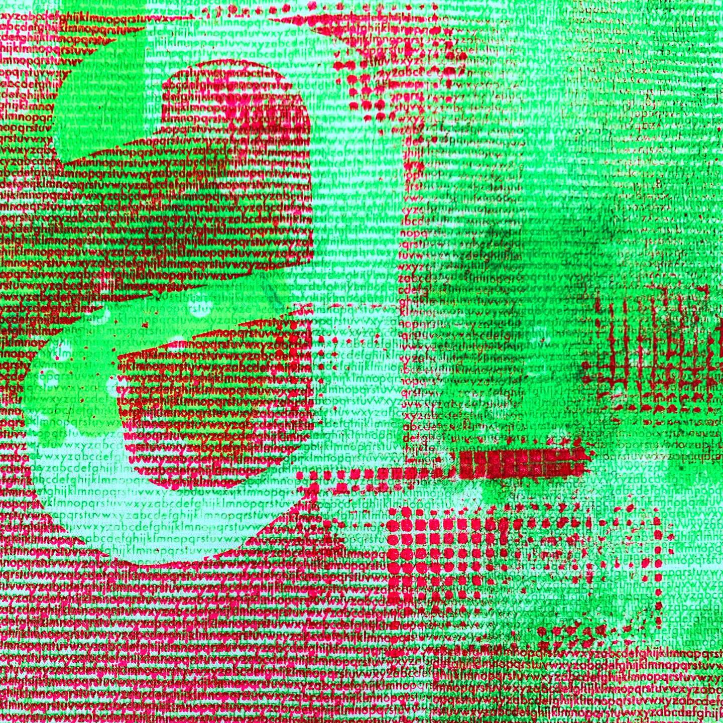
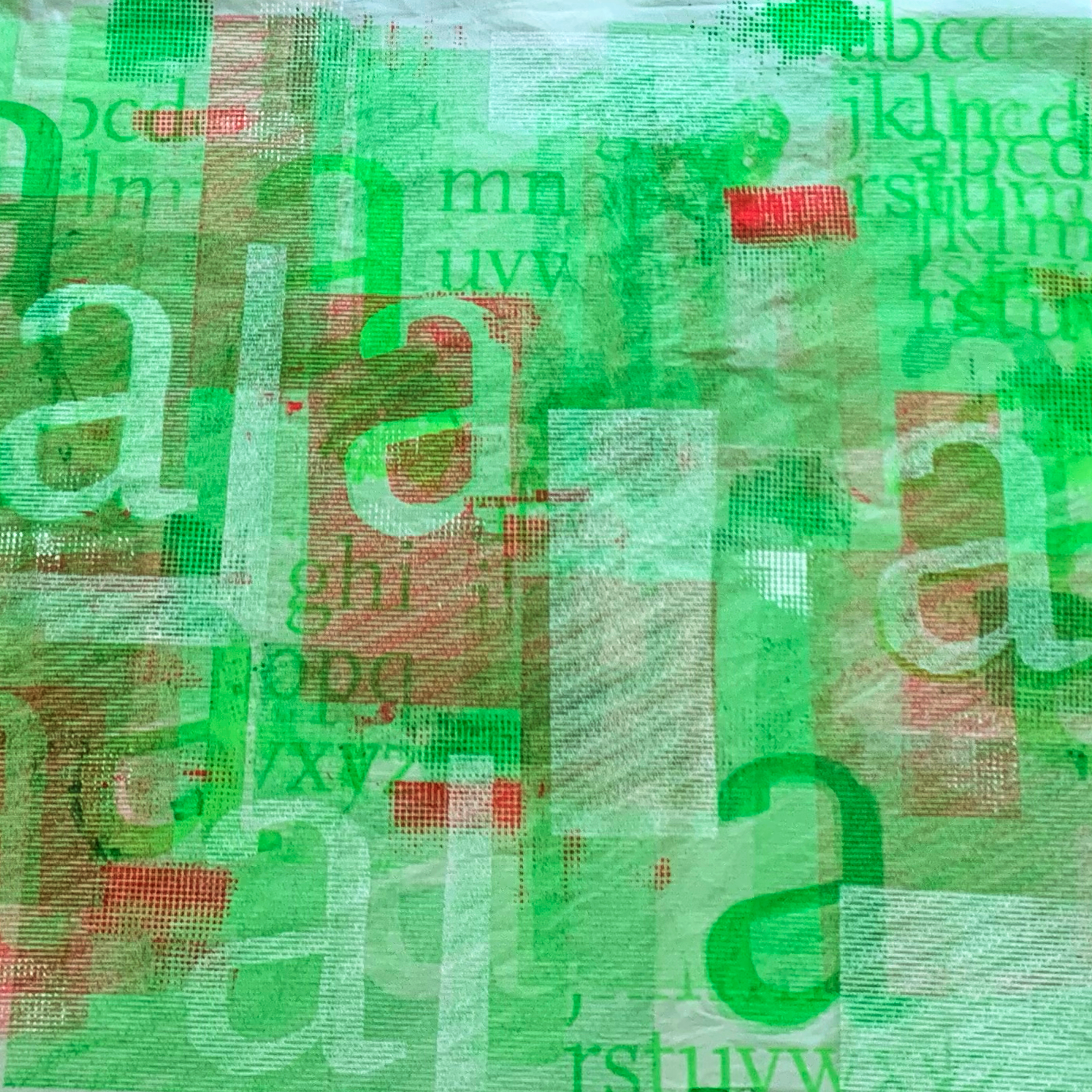
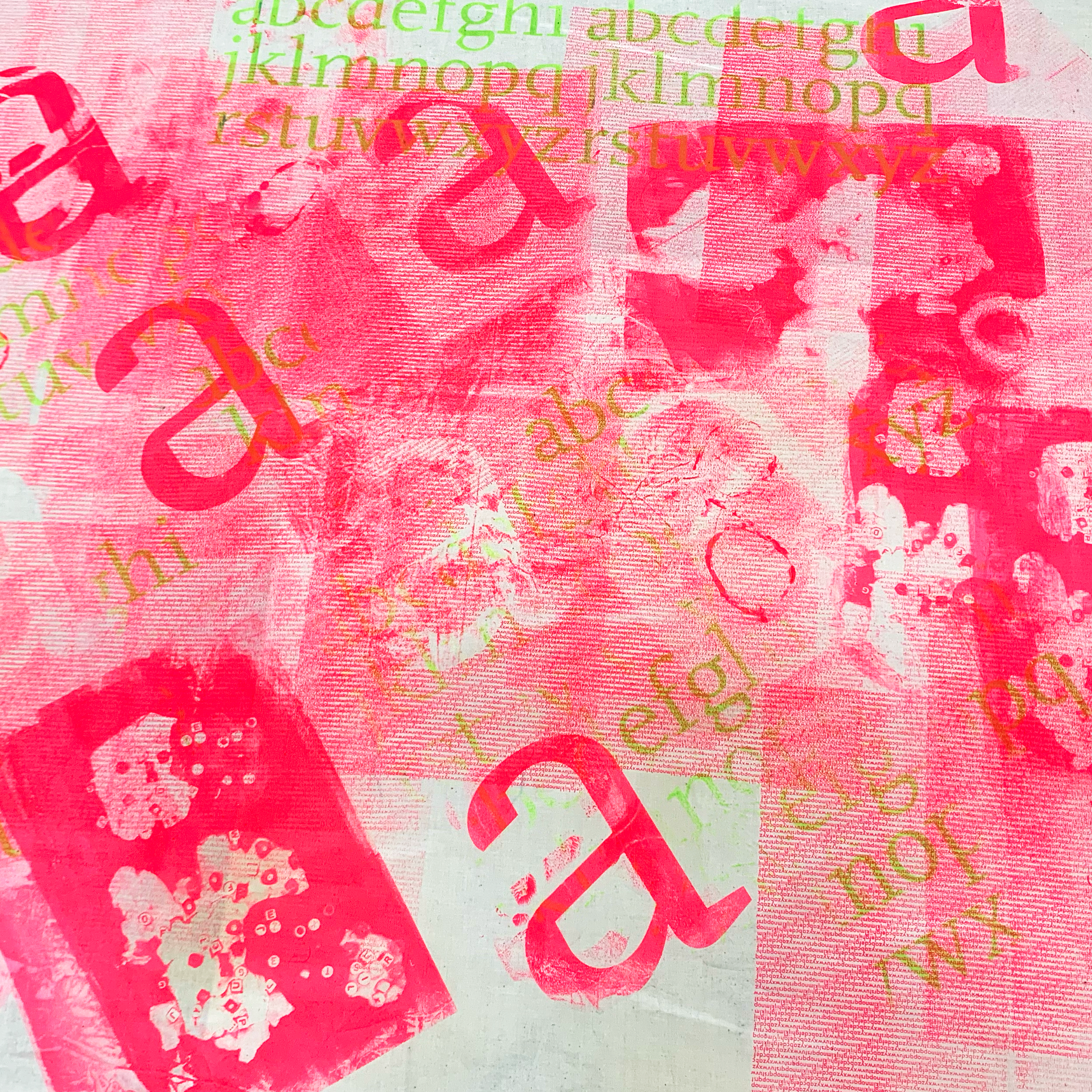
Once satisfied, I cut up the fabric pieces into even squares and composed them in a way that contrasted their movement and their colors. I pieced those together using my sewing machine. Lastly, I quilted overtop the entire piece, using the stitch lines to emphasize some elements and further exaggerate the "broken grid" concept.


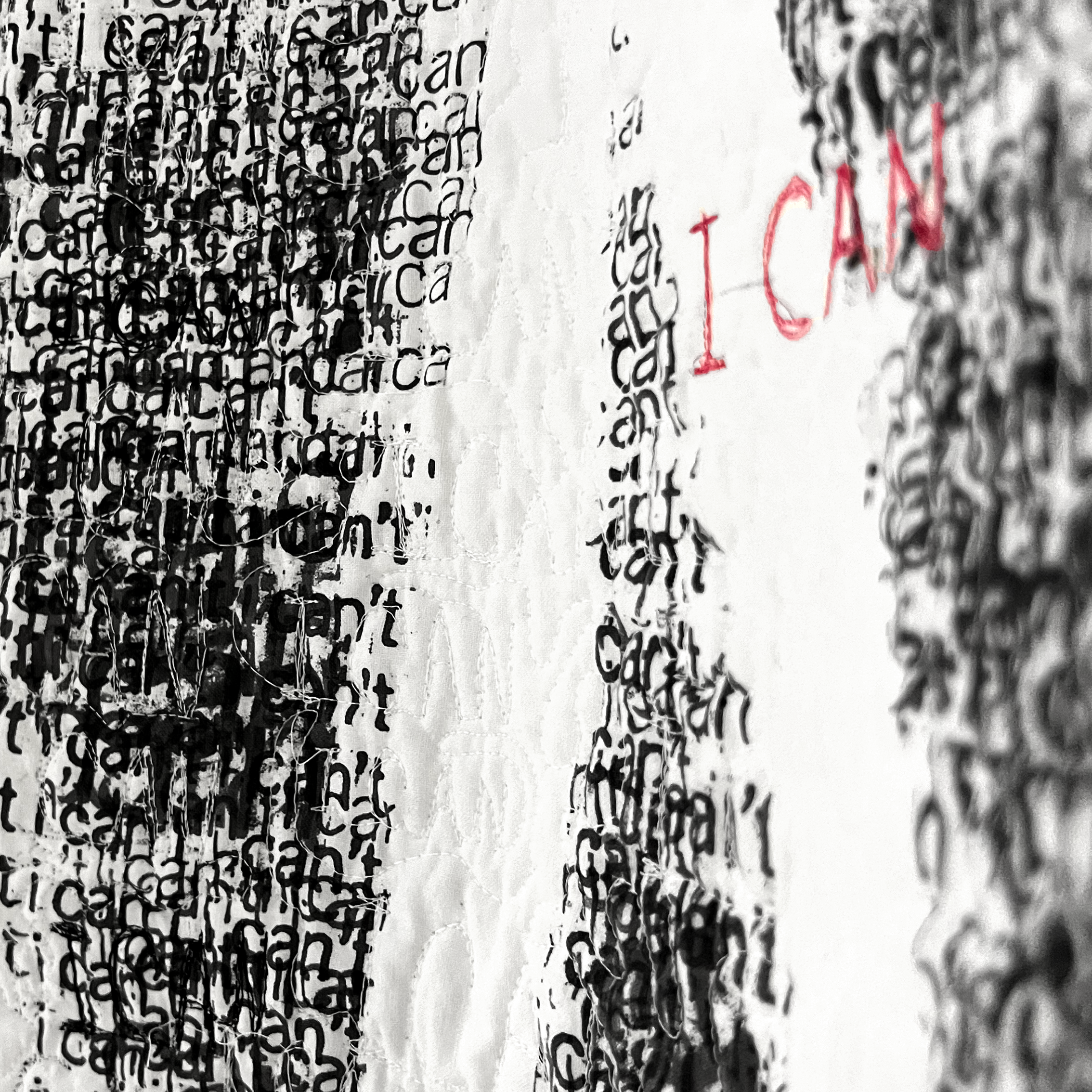
I CAN
This piece is about internal struggles, self-doubt, and confidence. I screen printed hundreds of duplicates of the words “i cant” all over white fabric. Creating a chaotic and unsettling experience for the viewer to sift through to find the words “I CAN” revealed in white. Through all the clutter and noise of self doubts, the viewer can see the empowering truth of it all. But as you look even closer, you can see the quilted handwriting reading “I CAN” repetitively all over the piece. These sewn words literally pierce through the words of self-doubt, but aren’t always as noticeable on first glance. While the self-doubt is surface level, the truth and confidence is permanent and deeply embedded in the piece.


Stitched
An award-winning typographic design of the Graphis New Talent Type Fonts A-Z competition.
This piece was made as an exploration of recreating the fond Helvetica. It became an exploration of the relationship between human and machine. Intentional elements (guided stitching) intertwine with elements made by fate (loose threads) to create letterforms that are impossible to replicate. The resulting characters express the tension between the geometric and organic aspects of Helvetica.

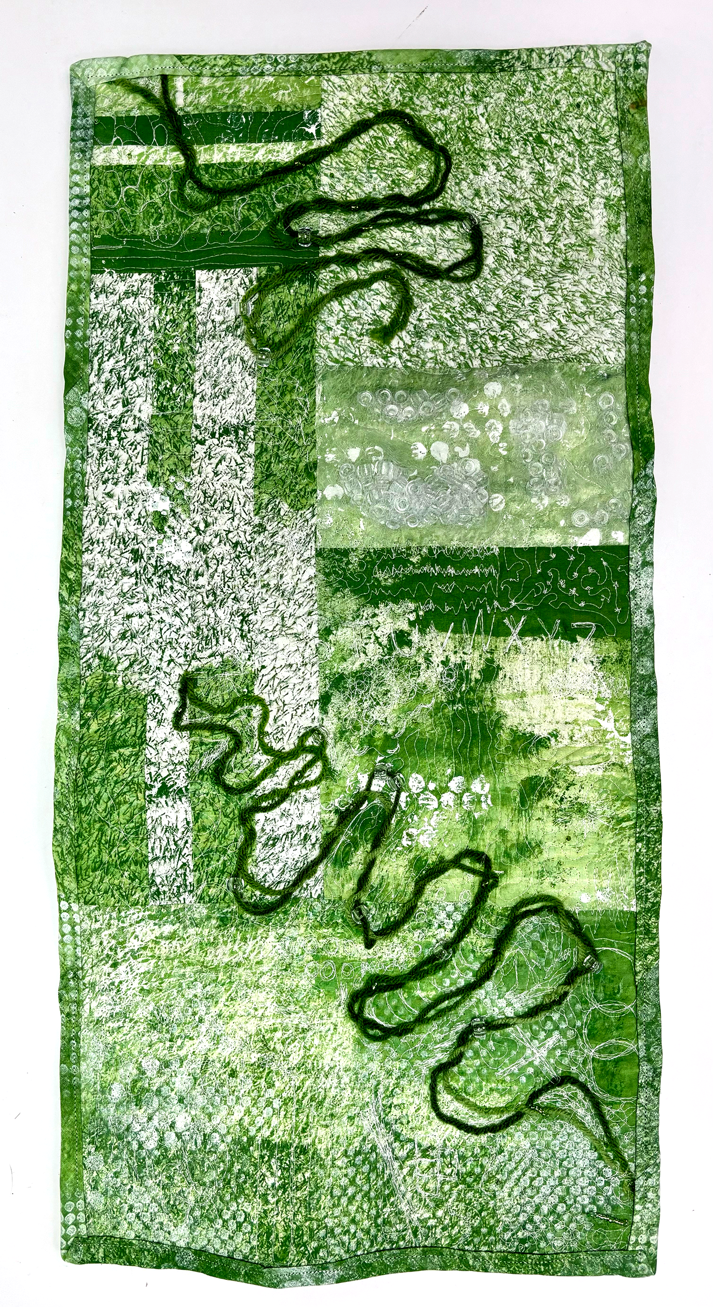
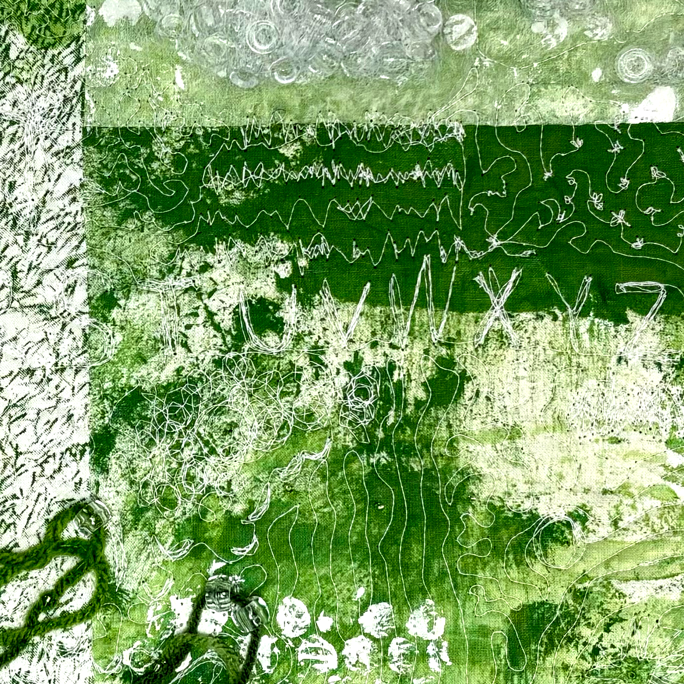
Textured
This piece was an experimentation on texture. How can I communicate a variety of textures in different tactile ways? How can I create both 2D and 3D textures? I screenprinted and painted textures on the surface of the fabric, cut them up and re-pieced them together. Then, I sewed yarn and beads into the surface, with a pocket made to hold beads and create actual 3D texture on the surface of the piece. Lastly, I quilted over top of everything. This is where I really let loose and experimented to find an abundance of unique textures through quilting.