HUGE Energy Drinks
Role: 3D Motion DesignerTools: Cinema 4D, X-Particles, After Effects
Time: 5 Weeks, 2024
HUGE Energy Drinks is a brand expression piece that promises a bigger and better lifestyle. It is a hyperbolic exaggeration of the energy drink brands that we see on the market today, often promising and promoting unrealistic outcomes.
Full process coming soon!
Process
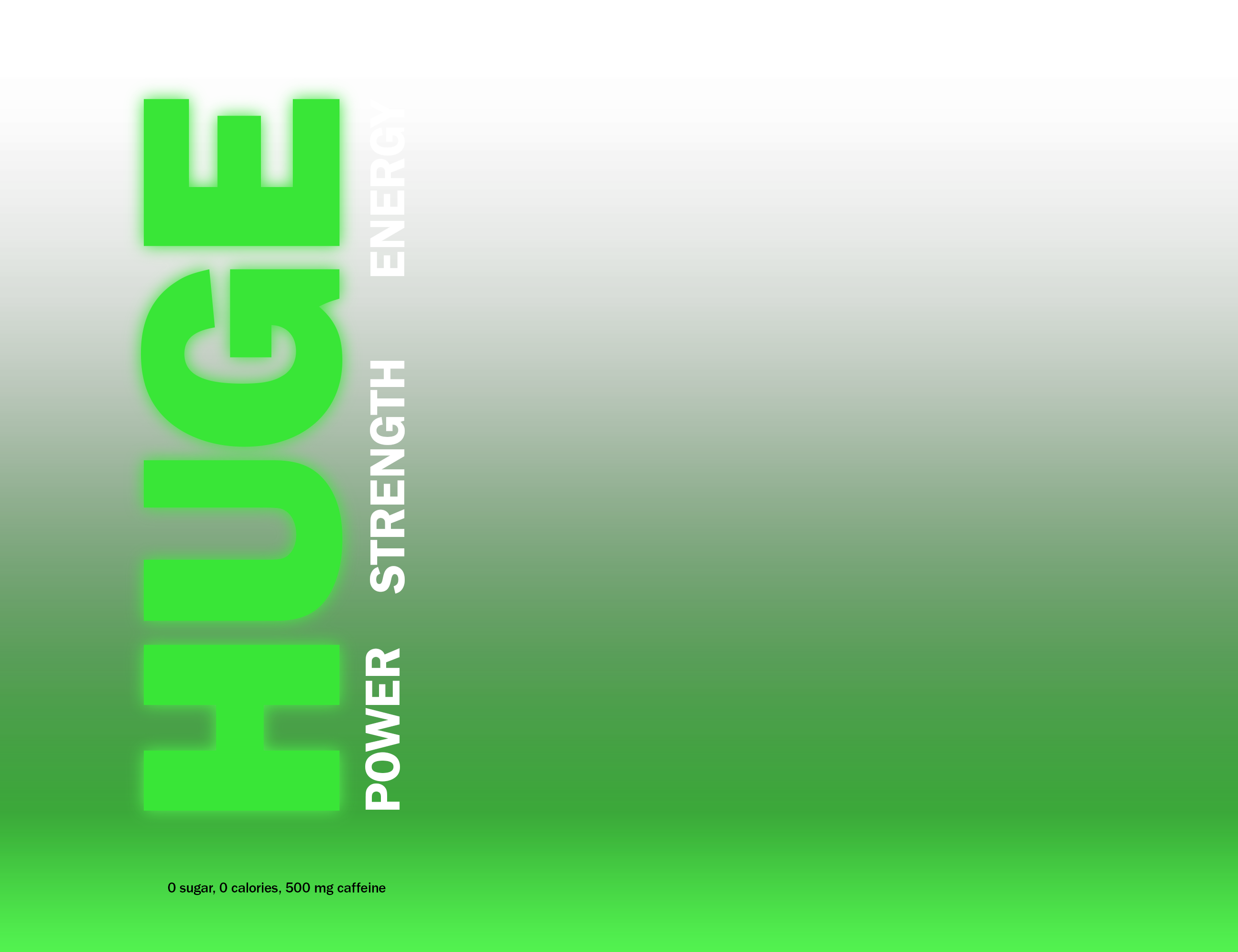
I first began with the brand. How might I poke fun at energy drink brands, while still making something that feels like it might be real?This line of thinking led me to the name “HUGE”. I feel that this word inherently has a sense of irony to it, which aligns well with the brand voice that I intend on creating. I began sketching out some logo designs, focusing mainly on the use of typography to amplify this exaggerated tone.

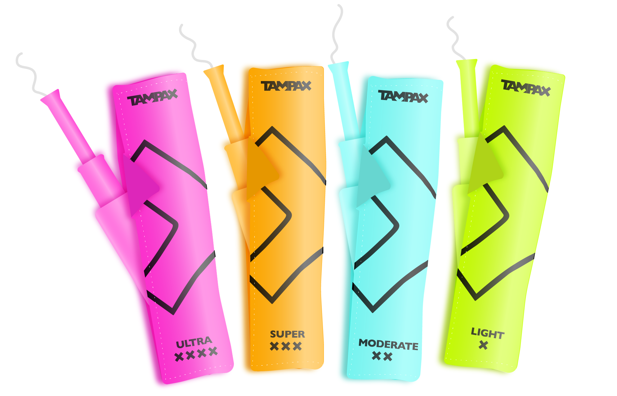
I also designed the product packaging for this piece, using typography to further emphasis this hyperbolic voice.



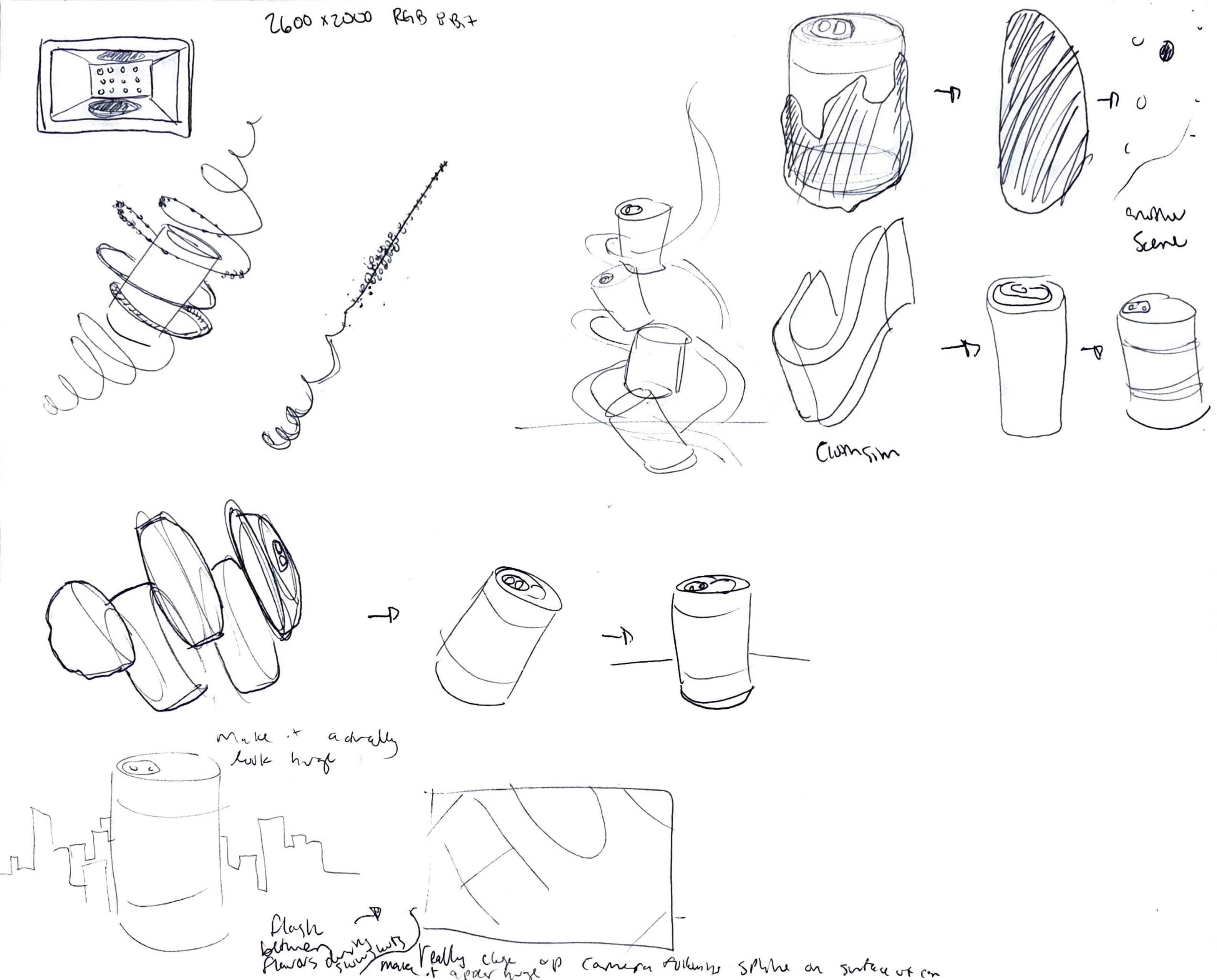
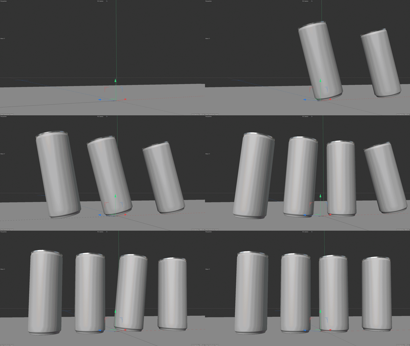
For me, this piece was an important project to get some practice in manually animating objects in Cinema 4D. I wanted to be sure that I pushed myself out of my comfort zone in terms of skillset, so I began with conceptualizing a variety of ways that the cans can animate in a playful way.


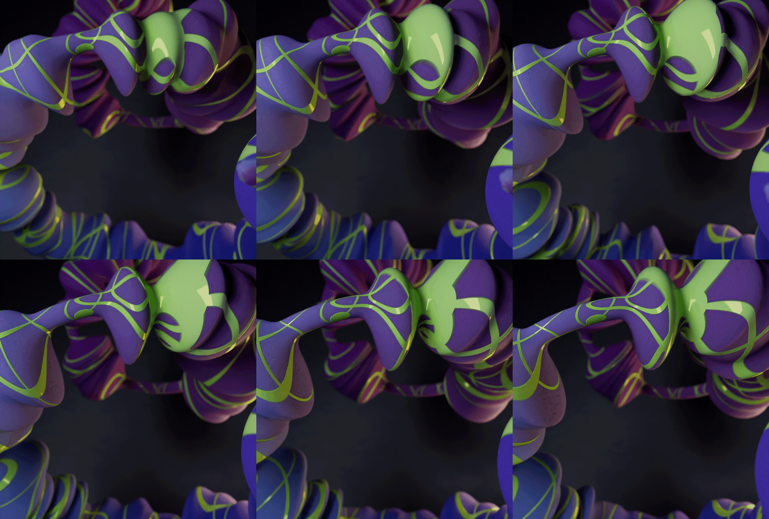
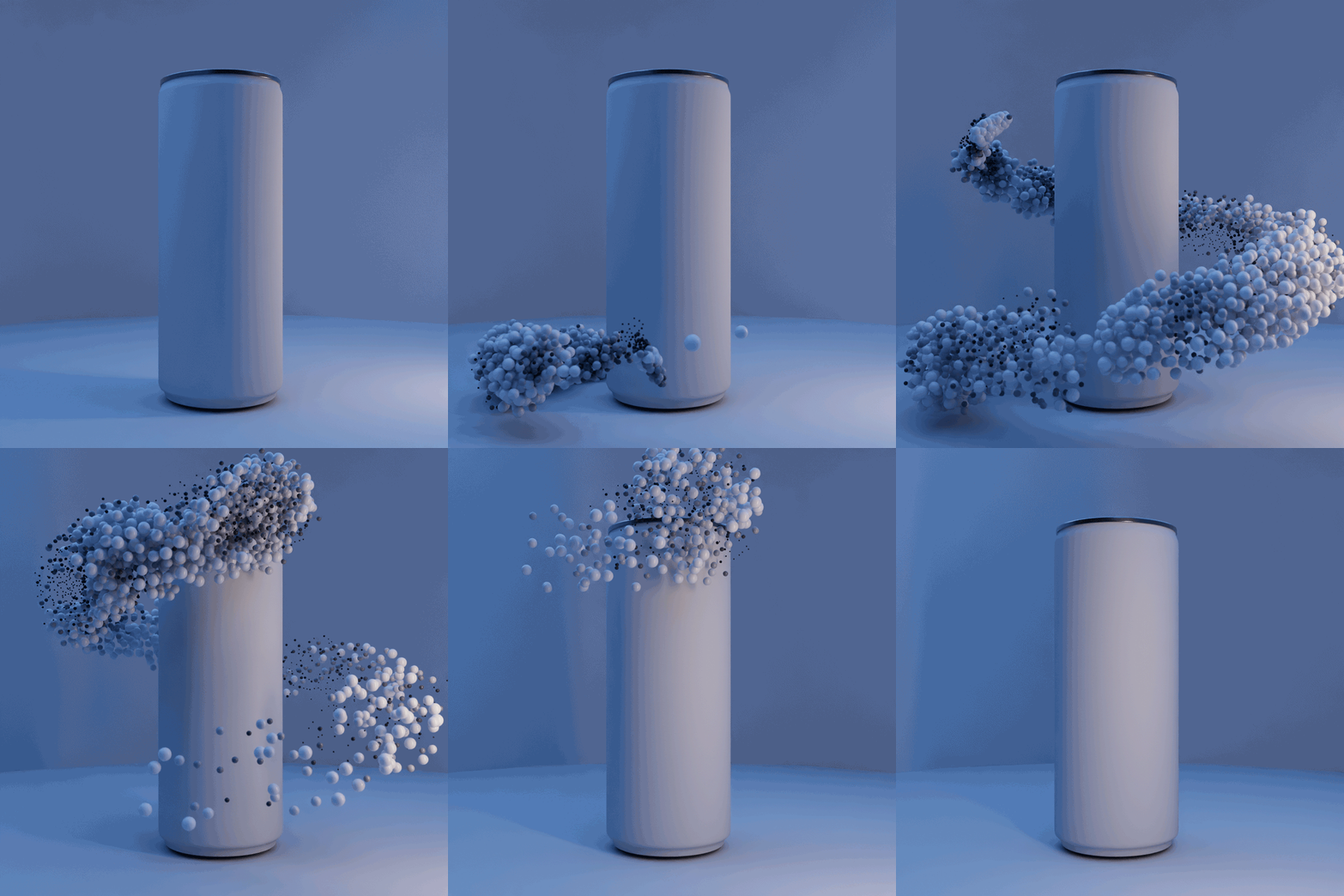
I began experimenting with animation based off the ideas I had sketched. I wanted to create an abstract element that could be repeated throughout the piece. I experimented with particle systems and texturing in Redshift to explore what this could look like.

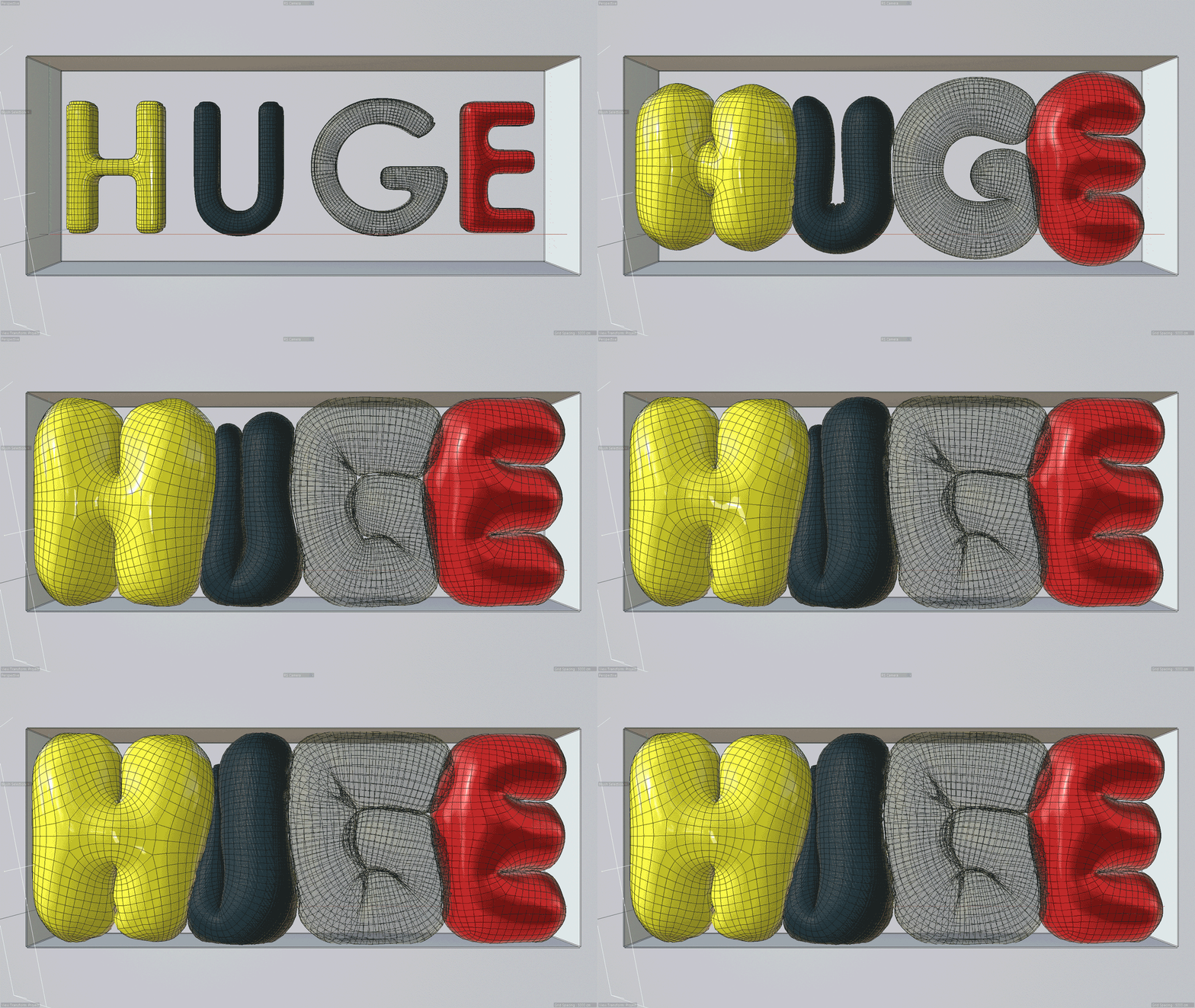
I knew that at some point in the animation, I definitely wanted to use some balloon simulations. While I had experience with this prior, I knew I’d have to get some experimenting in in order to properly create my balloons, have them animate smoothly, and apply a texture that wouldn’t shift while the balloons inflate.


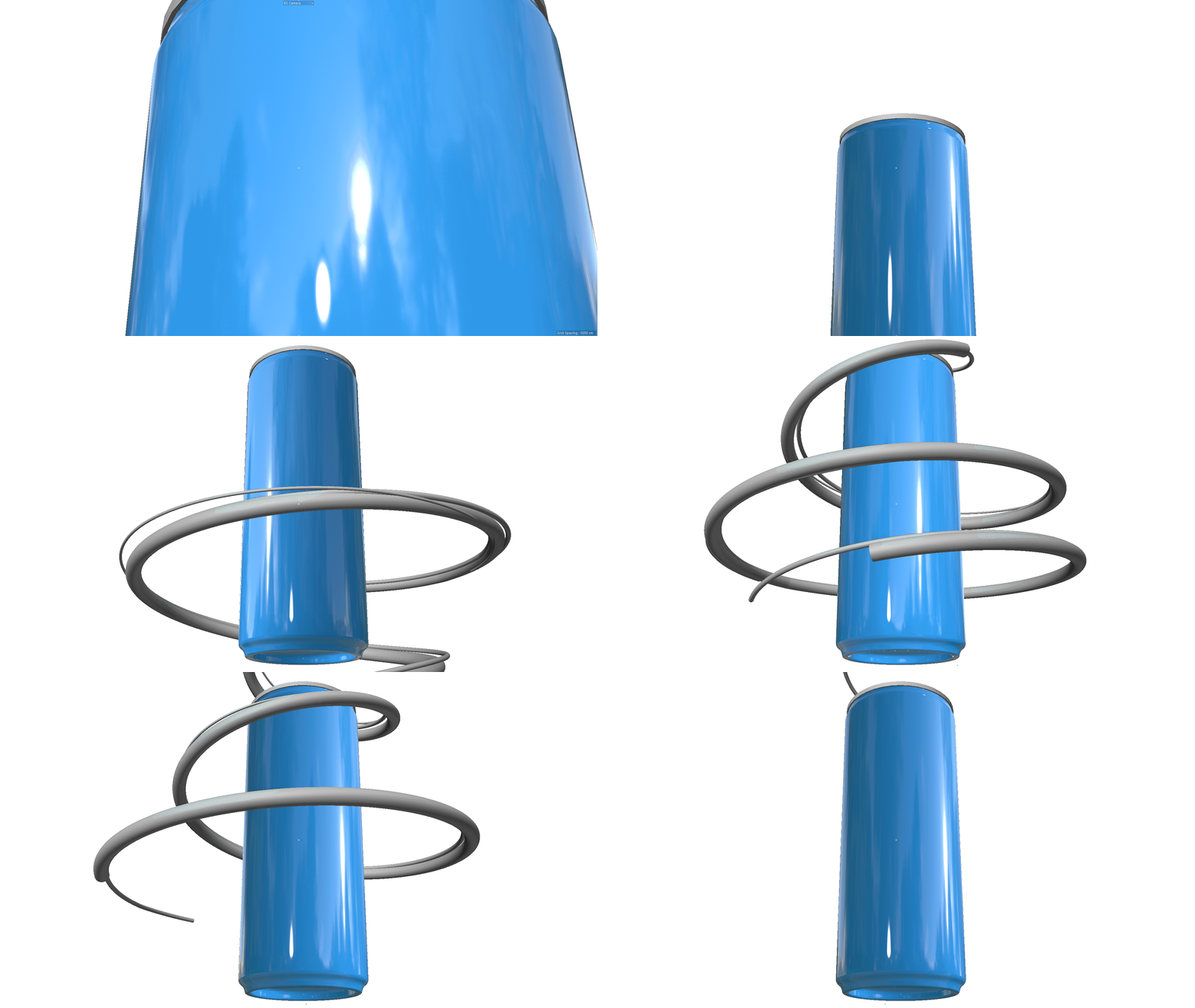
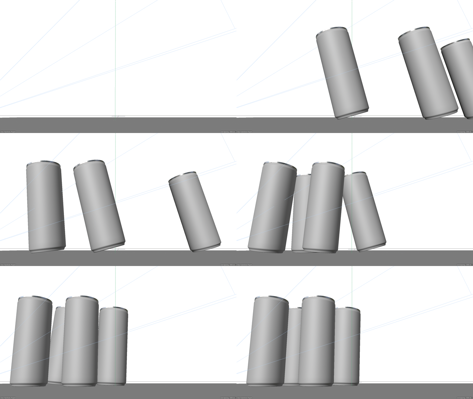
I then began working on the can animations. How can I give a naturalistic feeling to the motion of the cans in a way that would truly be impossible to see in real life?

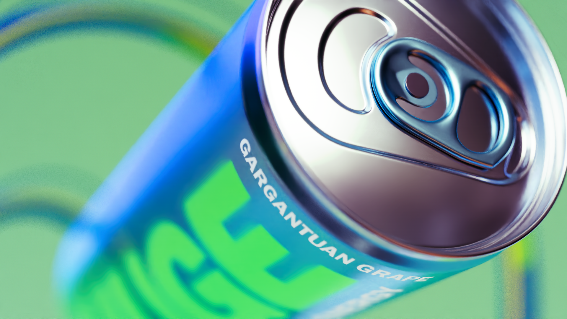
With the vision of the system coming together, I created 3 styleframes using cryptomattes to elevate the colors and rendering.


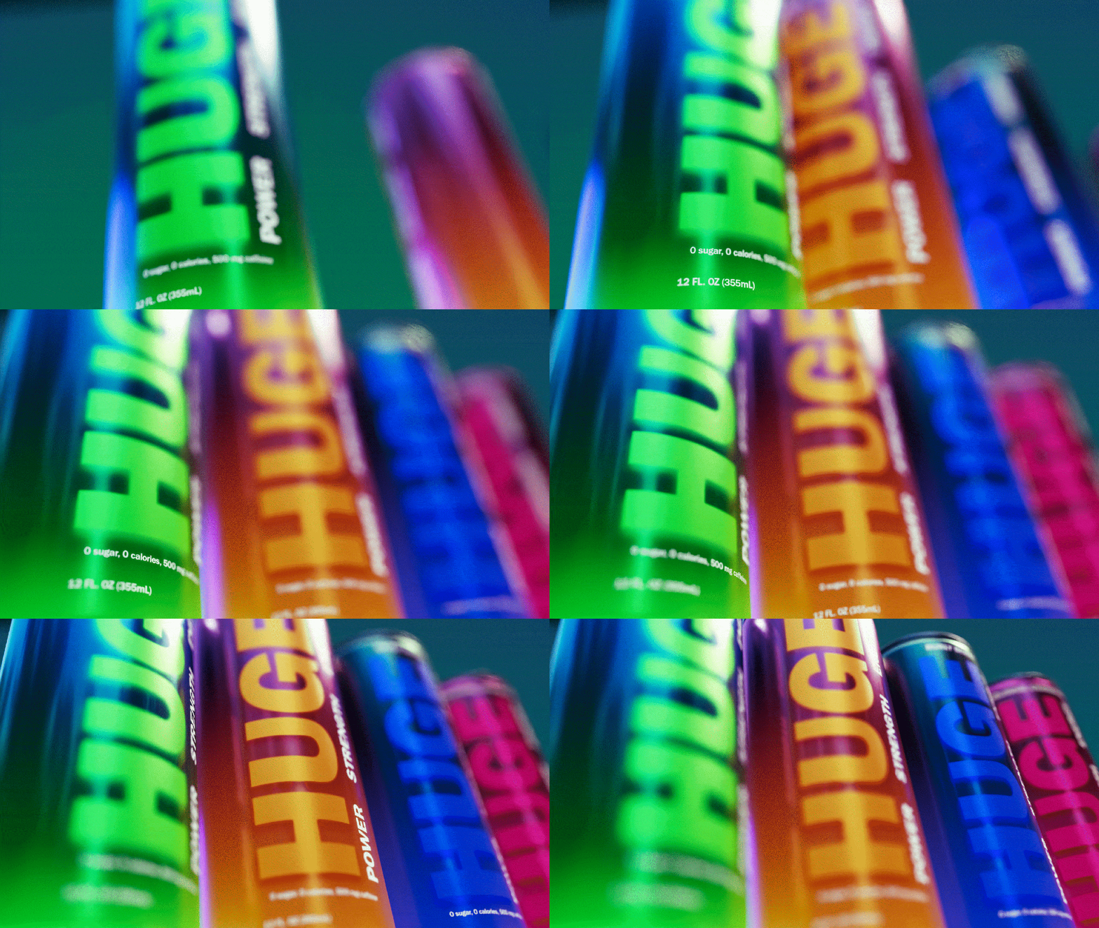
With the branding, rendering style, animation style, and motion systems determined, all I had to do was put it together. As always, there was plenty of re-rendering, re-animating, and final tweaks that were crucial to the success of this piece. I created an animatic to be sure that the animations could be timed out to the music, and then I went into interpolation editing mode.
Cryptomattes and compositing played a huge role in this project. Not only to help stylize my materials further, but also to mask in typography, and cut together different clips in interesting ways.

Takeaways
Overall, I was very happy with how this project came out. I was successfully able to fill some gaps in for myself in terms of animation methods that I felt I was lacking. It was also a fun way for me to use X-Particles and some dynamic simulations in ways that I had been itching to use in a project. Looking forward, there are some animations that I think could have better timing. This is something I think I am improving on but still see opportunity for growth.
