Gummy Packaging Full Process
Role: Graphic DesignerTools: Illustrator, Photoshop
Time: 5 Weeks to Present, 2023
A playfully modern redesign of gummy candy packaging.

How might I redesign the Albanese gummies packaging so that they appeal to an adult audience while still expressing the child-like joy that gummy candies bring?
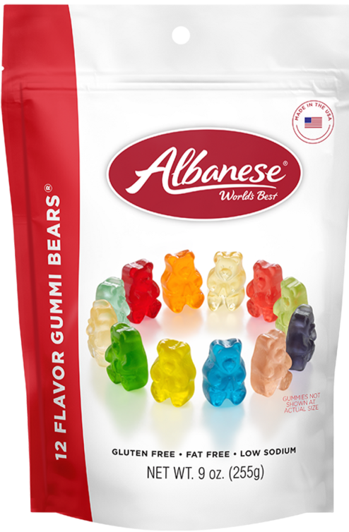
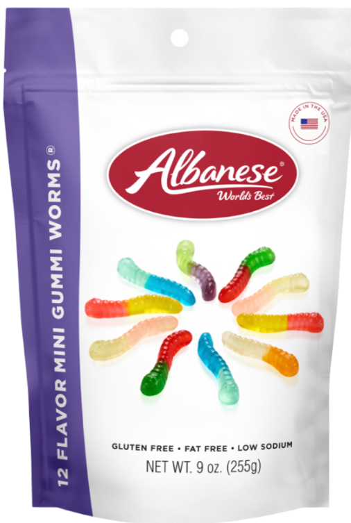
Existing Product Packaging
The Albanese packaging style is more formal than most gummy/candy branding. This formal style is less playful and more boring than competitive brands, which makes it stand out in a negative way in a grocery store.
The circular graphic of gummies feels particularly odd and lacks creativity stylistically.
Their attempt at a modernist & elegant design feels more geared towards an adult audience, which may be missing a huge opportunity of reaching younger audiences if their design appealed to both.
Ideation
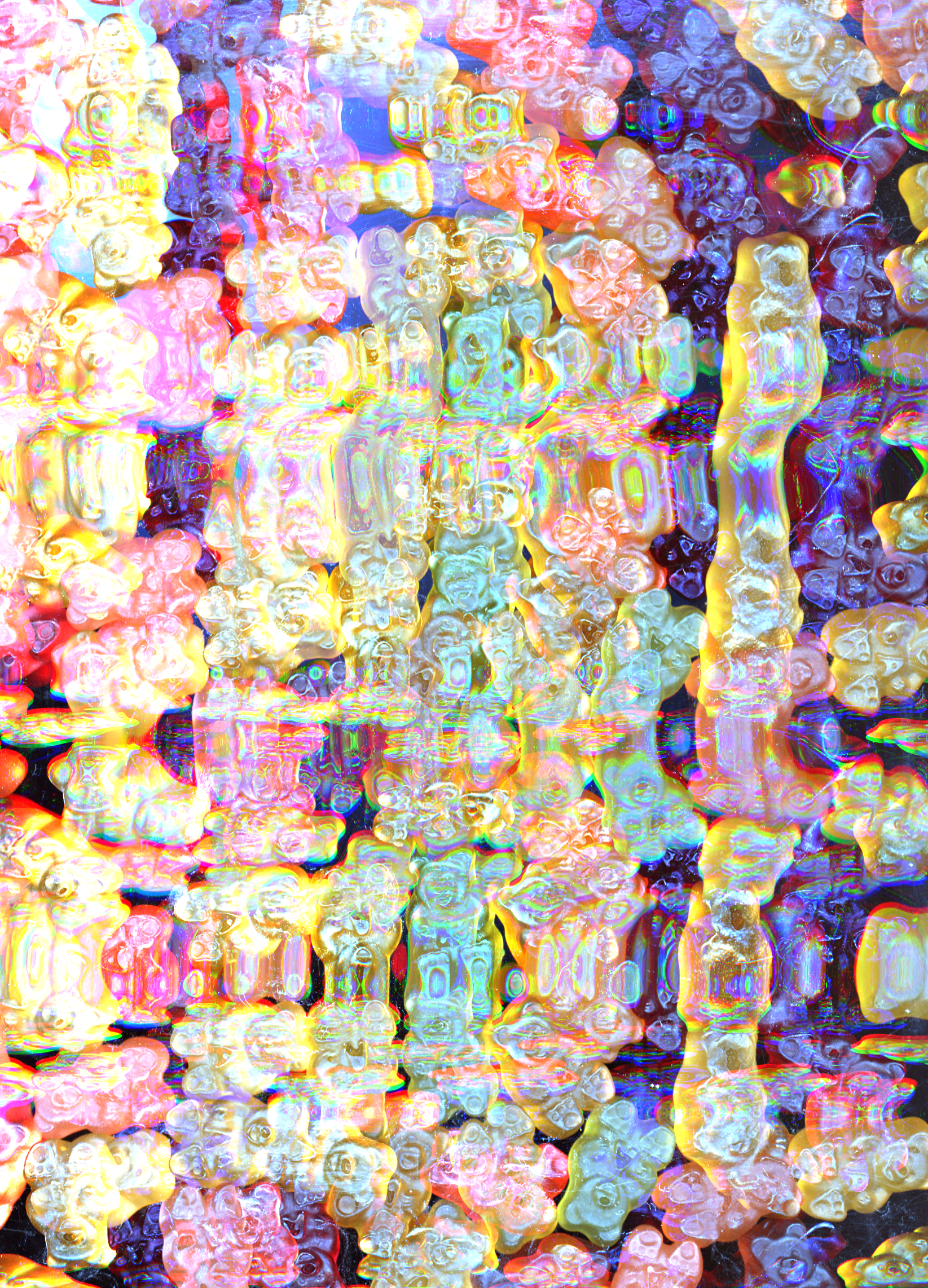
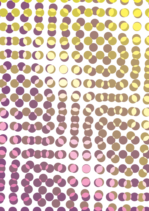
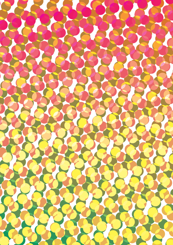
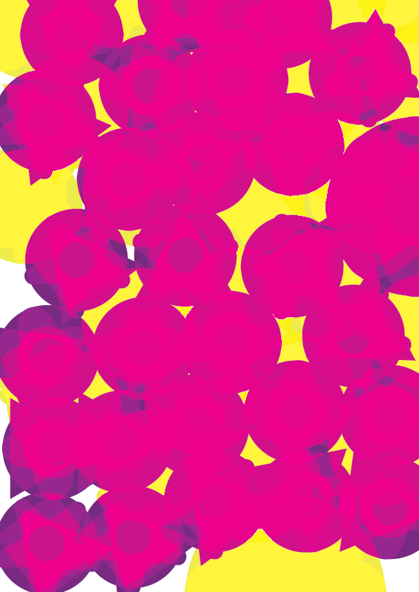
A big part of my process involved using the scanner. I experimented with pattern and texture by moving gummy bears and worms around on a scanner and playing with lighting. This ultimately was not a direction I ended up using directly, but it did spark my imagination with how I created shapes later on in my design process.










Concepts
Concept 1: Intertwining Typography
![]()

Concept 2: Overlapping Color as Pattern
![]()

Concept 3: Typography as Background
![]()

Concept Refinement
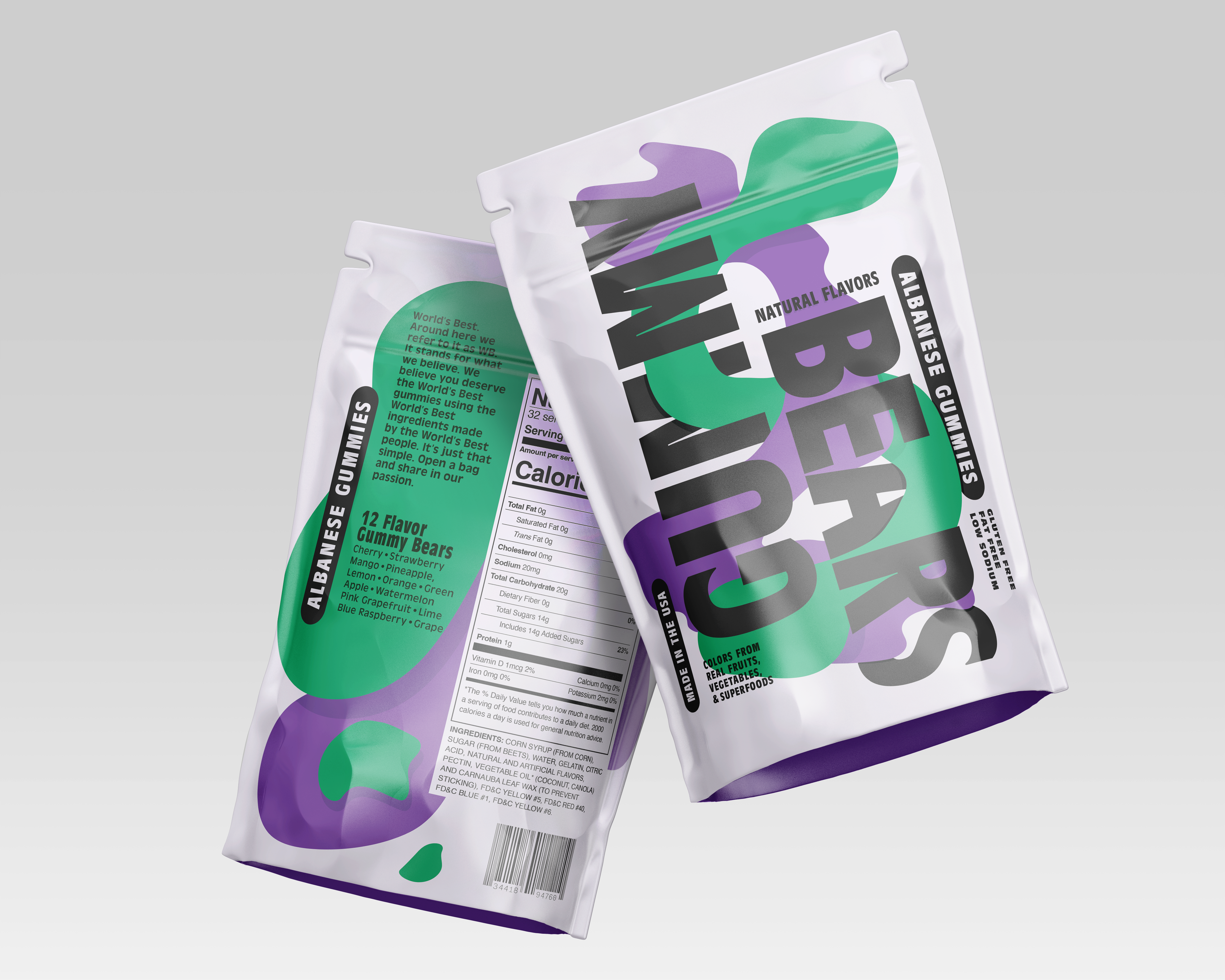
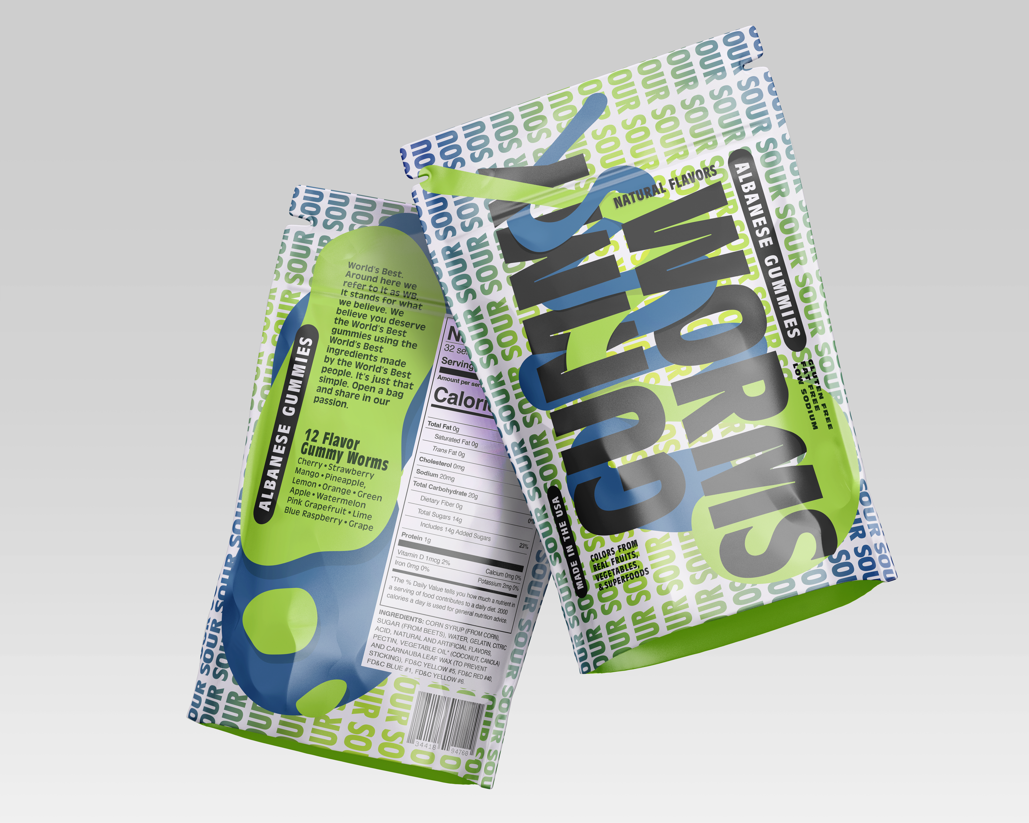
I ultimately decided that concept 1 (Intertwining Typography) is the strongest direction because its unique typographic style contrasts with the playful graphical elements. This mature playfulness appeals to both young and older audiences, and is like no other candy packaging.


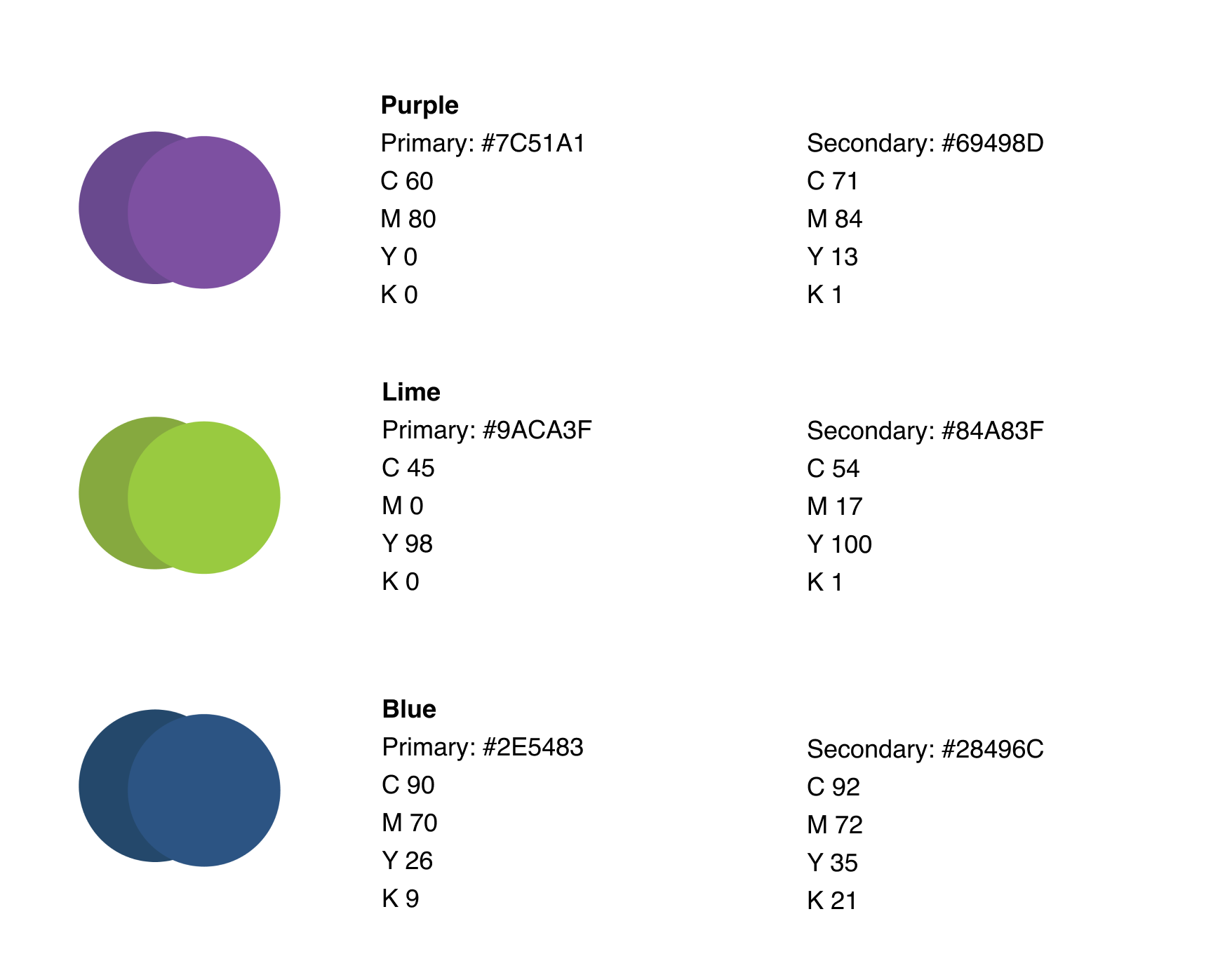
Brand Guidelines


